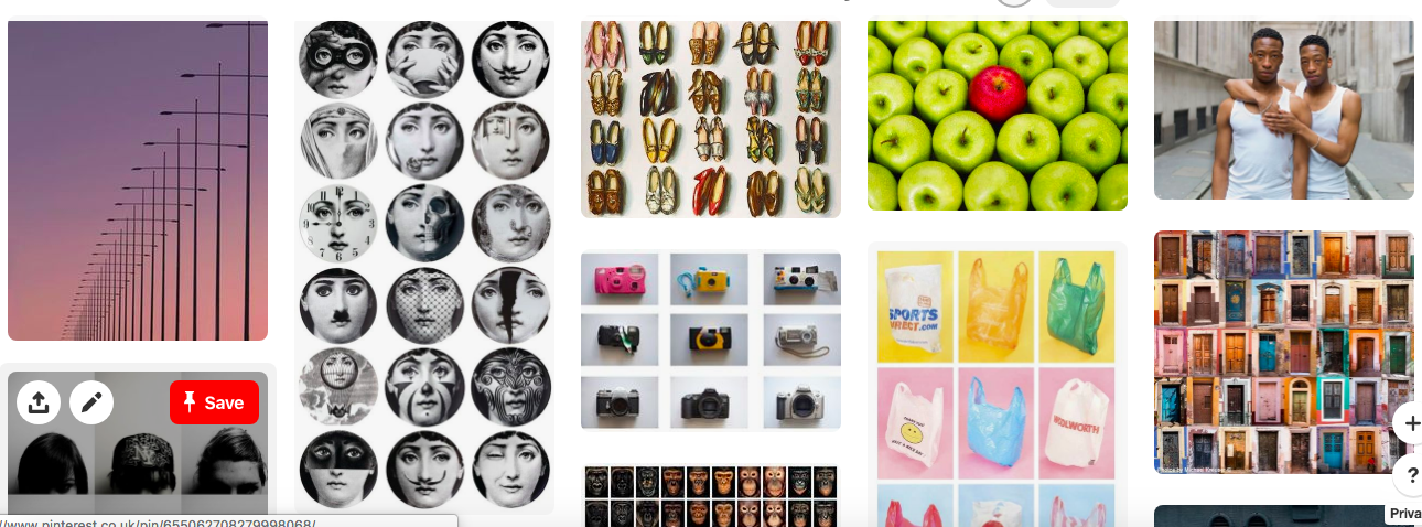
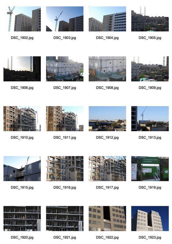
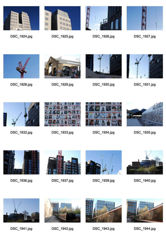
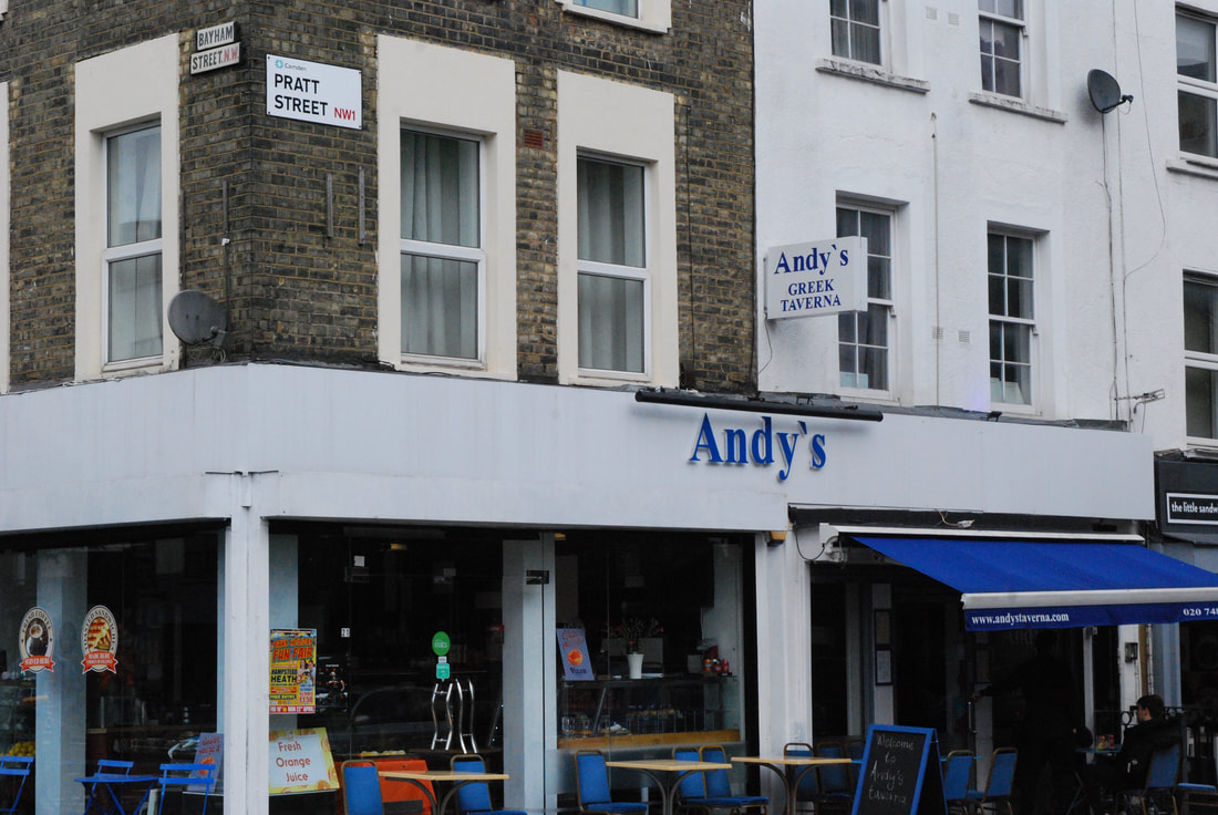
Pintrest Board:
Typology Task:
|
|
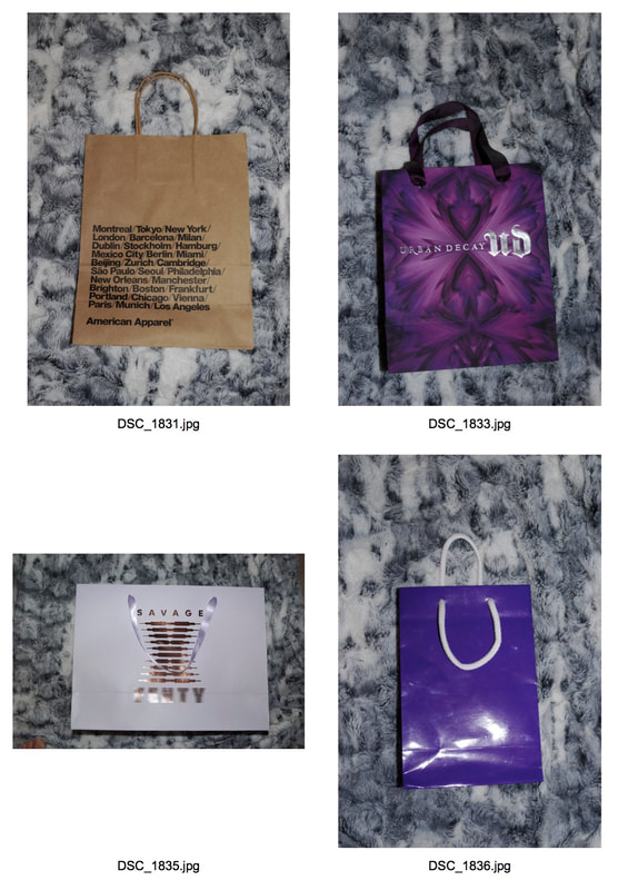
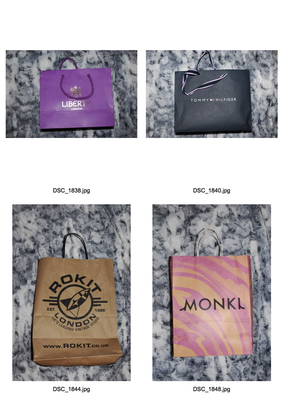
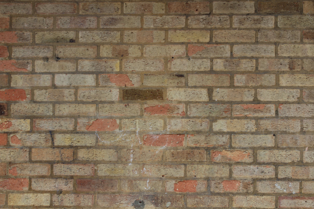
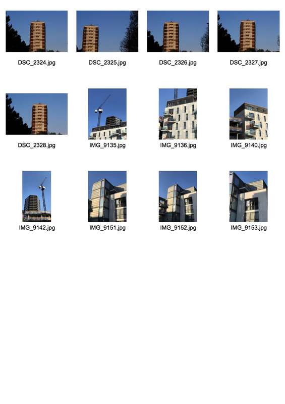
I started experimenting with typology by looking at different kinds of bags I had in my room from different shops. I tried to make sure I took the photos from the same angle but faced difficulties as the bags were all different sizes. I used my digital camera and flash to make the colours on the bags crisp. I used my duvet cover as a background but I wanted to use a coloured background such a light pink so I am going to re-do a typology task and use a plain white background and then experiment with coloured backgrounds on Photoshop. For my next typology task I want to use different objects such as; plastic bags, hairbrushes, hair clips etc, and I am going to make sure all the images are portrait so they fit into a contact sheet more efficiently. However, I feel as if this was a successful first attempt at the typology task and I am definitely going to go back to bags as each one has so much detail but ultimately have the same job.
Typology- Second Response:
|
|
|
|
|
|
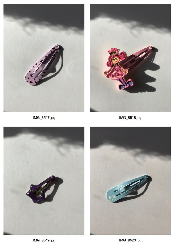
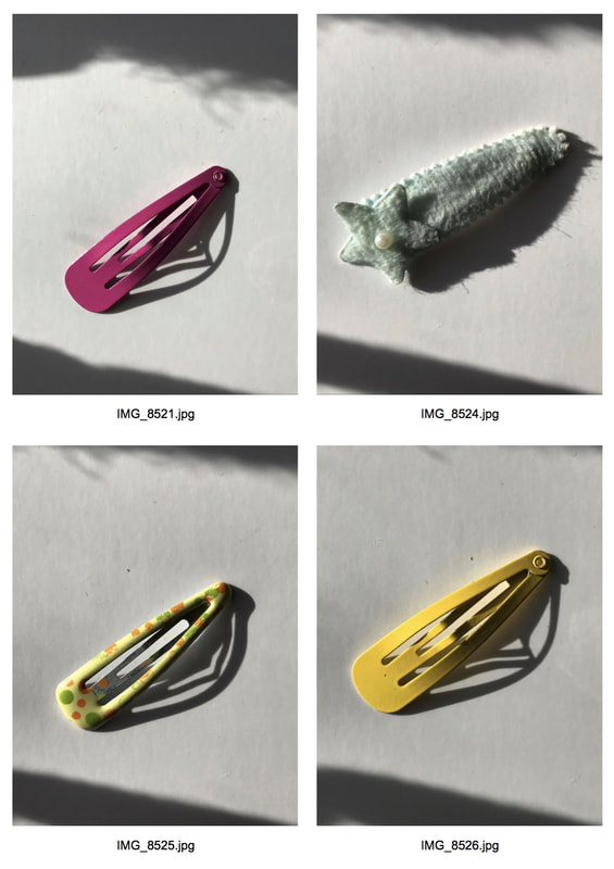
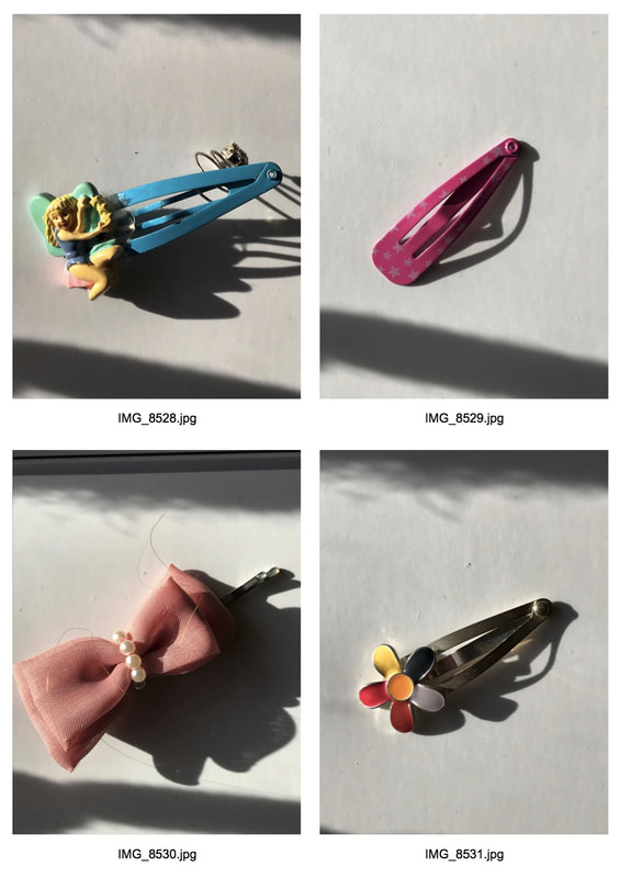
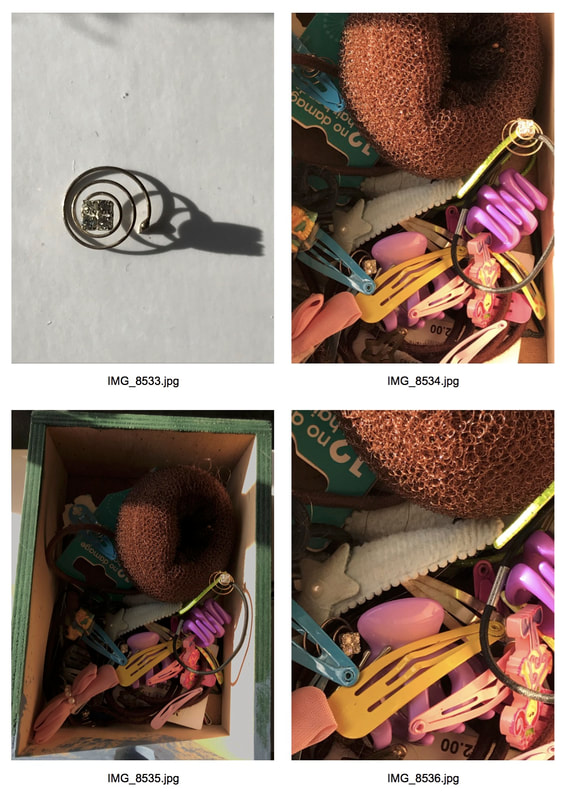
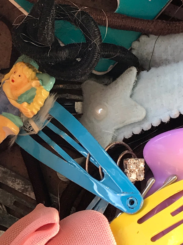
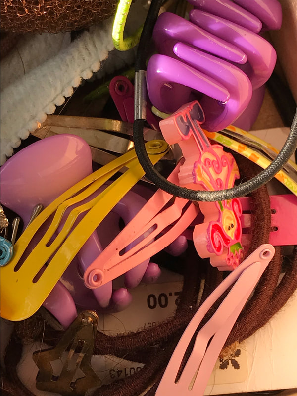
For my second typology task I used childhood hair clips and my iPhone. I used my iPhone as I find the flexibility to zoom in on phones easier then cameras additionally, because I was photographing small objects, holding a phone allowed me to capture closer up details that my camera cannot zoom into. I used a white background for the clips (instead of my duvet, such as with the bags) which worked out more effective as it did not take away the focus of the object and colours within the object. Furthermore, to improve from my last typology task, I made sure all the images were taken from the same distance and angle so they would look more effective in a typology contact sheet.
The extreme close ups of the clips in the draw are an experiment. I could not take images as successful as these with my camera as I cannot zoom in as close. I really like these images as the sunlight reflects perfectly on the brightly coloured, overlapping clips. The colours of the images work as an emotional indicator, the washes of bright blues, pinks and yellows are reminiscent of childhood and inherit a dream-like feel.
The extreme close ups of the clips in the draw are an experiment. I could not take images as successful as these with my camera as I cannot zoom in as close. I really like these images as the sunlight reflects perfectly on the brightly coloured, overlapping clips. The colours of the images work as an emotional indicator, the washes of bright blues, pinks and yellows are reminiscent of childhood and inherit a dream-like feel.
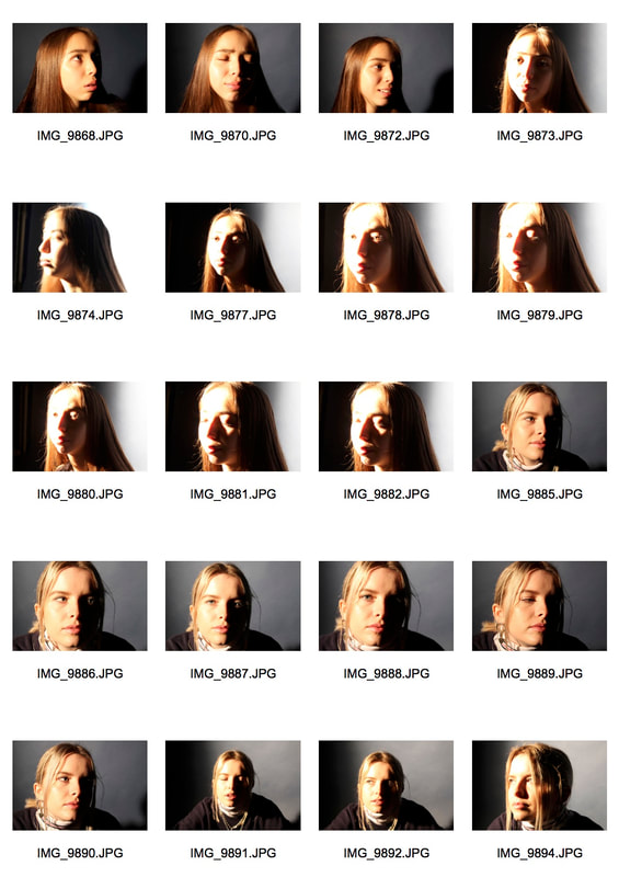
Focus Task:
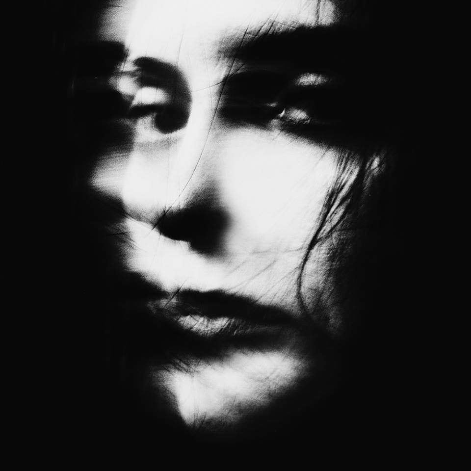
Artist Ralph Eugene Meatyard was an American photographer who made his living as an optician. Through his association with the local camera club and his connections at the university in Lexington, Kentucky, Meatyard was in contact with many other photographers, such as Van Deren Coke, whose condition for making a photograph was to find an appropriate background and put something in front of it. Meatyard eliminated the “thing” and looked only for the background, which he would then throw out of focus. Eventually, feeling that the background was still too recognizable, he abandoned this practice and began to contemplate his surroundings through an unfocused lens. As an artist, he experimented with various strategies including multiple exposures, depth of field, motion blur, and other methods of photographic abstraction. He created a series called 'No Focus' which is particularly concerned with focus and dept of field, stretching the expressive potential of photography, film and cameras when looking into the ordinary world. I am going to create my own response to Meatyard's work by experimenting with focus and depth of field with a digital camera. My aim is to photograph both man made and natural structures but also to try and get multiple images of the same structure with different depth of fields and focus.
Artist and Me:
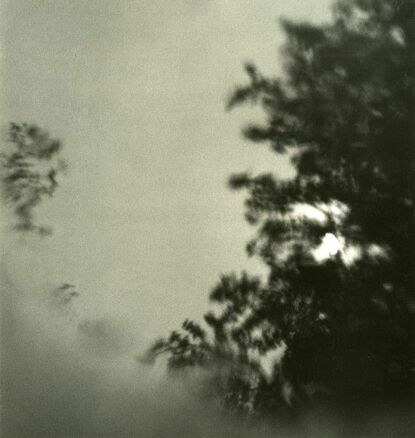
Ralph Eugene Meatyard's method is subversive, he produces images that require the viewer to be active, question what they are seeing and ultimately look at ordinary structures in a different way. Meatyard spent three months looking through an unfocused camera in order to “learn to see No-Focus.” This was one of my favourite images from the 'No Focus' series as it challenges and distorts a natural structure. Additionally, the image carries a slightly haunting edge which is all created through Meatyard's subversive method.
|

My image.
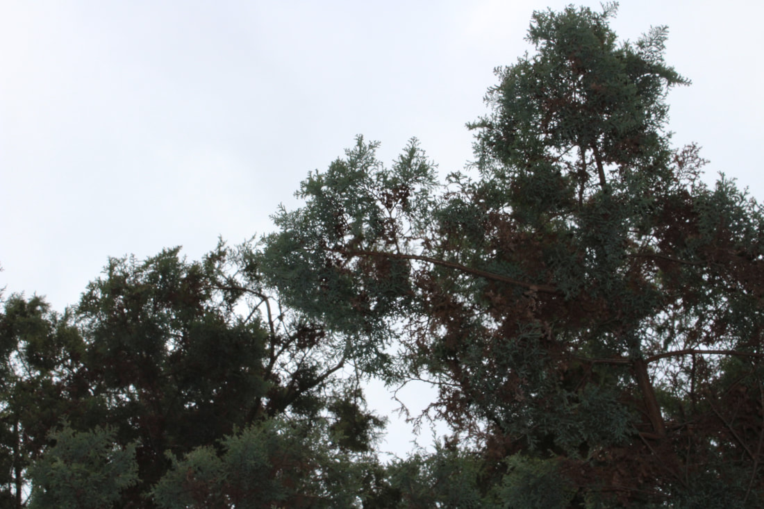
Instead of fixating on how much I would change the depth of field and focus, I tried use Meatyard's technique of 'learning to see 'Non-Focus.' I did this by not just experimenting with focus then taking a photo but instead, viewing the structure in front of me and just moving the zoom while picturing the structure. I felt this reflected Meatyard's technique as I almost allowed my eyes to determine the focus, not the camera. I found it more effective to blur natural structures rather then man made ones as nature is a bigger force then man and thus being able to distort is creates a more significant effect. Additionally, I liked the dark and slightly haunting feeling that Meatyard's image carried and found that this feeling was only carried within images of the natural as man made structures are not alive and thus not really threatening.
|
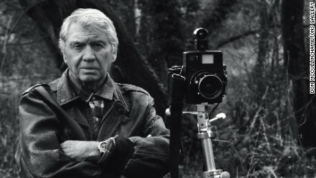
Exhibition: Don McCullin
|
I visited the Tate Britain to go see Don McCullin's exhibition which show cased his work over the last 60 years. It included many of his iconic war photographs such as images from; Vietnam, Northern Ireland and more recently Syria. But it also focused on the work he did at home in England, recording scenes of of poverty and working class life. Understanding Don McCullin's life helps you to understand his work and the motivation behind his work. In 1950 his father died and he was forced to give up his scholarship. In the RAF (1954-56) his friends brought him a camera (his first camera) as he failed to qualify as an RAF photographer. In 1956-1959 he worked as a darkroom assistant. In 1958 he took a photo of a gang which changed his life as it was picked up and printed by the Observer in 1959.
One of the quotes I admired whilst attending the exhibition was, "Photography for me is not looking its feeling, if you can't feel what you're looking at, then you're never going to get others to feel anything when they look at your pictures." |
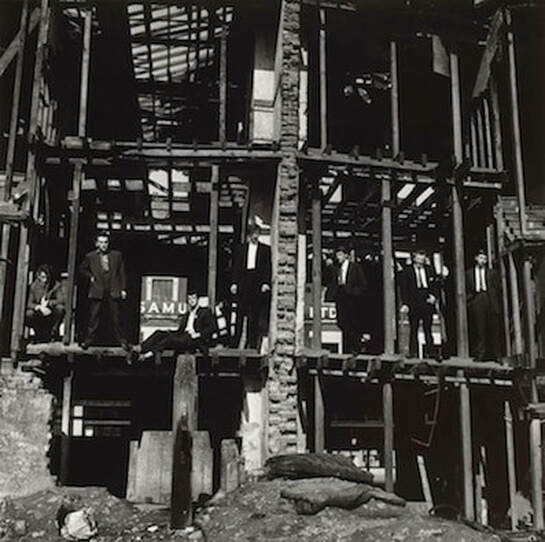
Photo of gang taken in 1958. The photo is taken at a low angle which reinforces the gangs dominance. The photo also follows the rule of thirds which makes it fill the frame perfectly and thus stand out more. This photo stood out to the observer and they asked McCullin if he could take more.
|
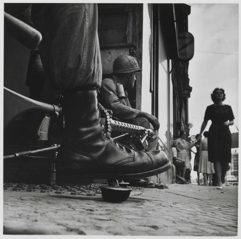
Near Checkpoint Charlie, 1961.
McCullin felt compelled to document the construction of the wall in Berlin designed to prevent further defections. He wasn't sent by a newspaper and so had to cover his own costs which just reflects his personal determination and passion.
|
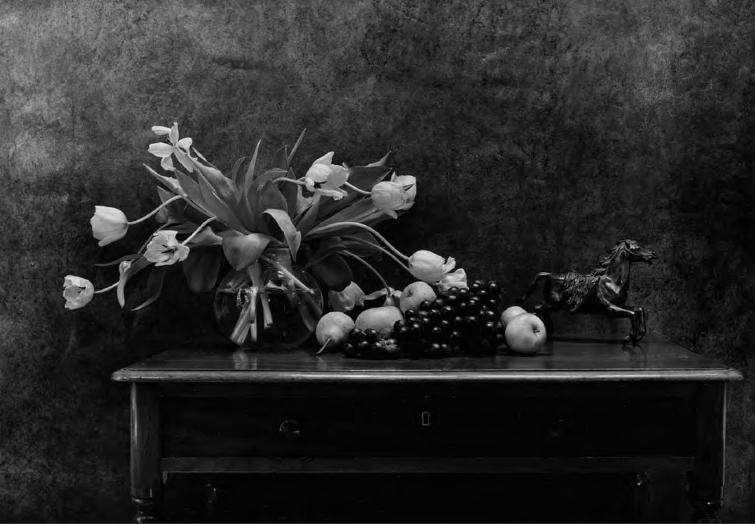
Flowers and Fruits, 1980
Since the 1980's, McCullin has explored still life photography in order to escape his memories of war. The escapism of the process refreshes and renews him and provides as an antidote. However, through overprinted images, there is a clear dark tone to his work. I see the dark tone as the impact of war still imprinted in McCullin's mind. The implications of his earlier employment live on in subtle traces.
|
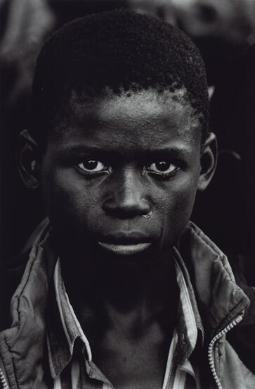
The Aids Pandemic, India & Southern Ethopic. A boy at the funeral of his father that died of AIDS, Kawama Cemetry Zambia, 2000
McCullin always ensures he is close enough to people so that they know they are being photographed, even trying to look them in the eye to gain their unspoken permission. This unspoken permission results in a strong connection between subject and McCullin, as can be seen in this image with the strong, deep eye contact.
|
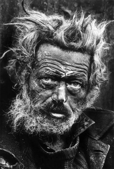
Homeless Irishman, Spitalfields, London, 1969.
McCullin's photographs of the East End differ from his conflict images because he treats the subject matter in a different way. For example, McCullin takes portraits of the people he meets in the East End, the images focus more on the individual rather than the environment that they are in. He frequently crops out the background so the individuals face fills the whole frame. “I started seeing people sleeping in shop doorways and when I went to Third World countries people would refuse to believe there were poor people in England,” McCullin explains. “But there were many, many untold truths about this country, we had poverty, we had unemployment, we had a class system that wasn’t convenient, all kinds of things that people who lived outside of England wouldn’t have understood."
|
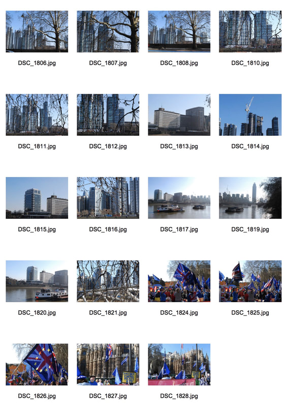
Variation within the city- Trip walk
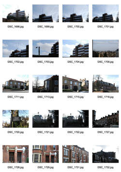
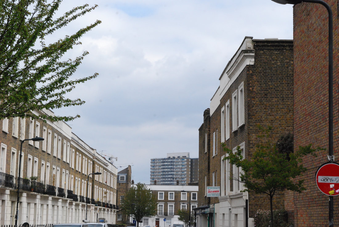
After the exhibition, we went on a walk to capture the variation and similarity within the city. I photographed nature in front of modern buildings as felt it reflected the variation within the city, we have beautiful nature right next to man made constructions. In my images of the tree branches in front of the buildings, it is almost like the buildings are over taking the nature, the modern world is ever-growing but nature still lives along side it. As we were walking we also passed a Brexit march which I thought fitted perfectly with the variation and similarity theme as Brexit has caused a divide within the nation and thus represents the variation and similarity of the opinions in the UK. I used my digital camera but never flash as the lighting this day was perfect for example, the sun reflected onto the glass of the buildings which almost emphasised their dominance against the flowerless trees. I really like the idea of 'variation and similarity within the city' and think I will develop it once I start my strands.
Google Maps GIF
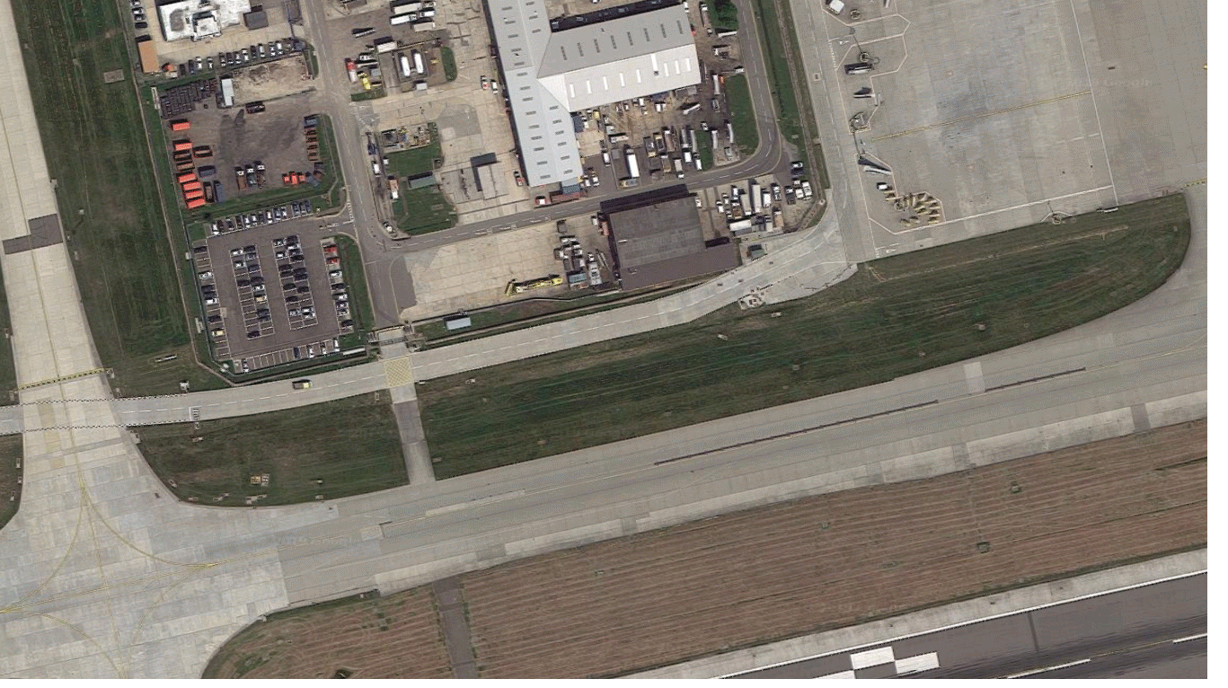
Ireland-based artist Páraic McGloughlin creates short films which explores the similarities of international roadways, farming infrastructure, and urban design. McGloughlin presents thousands of aerial images collected from Google Maps to create a series of winding pathways and geometric shapes that snake across the screen. To create my own response, I choose to use screenshots from Gatwick airport as it's a place I have been to multiple times and I think it is a good example of the contrast between man-made constructions next to rural areas.
Variations in layout and part:
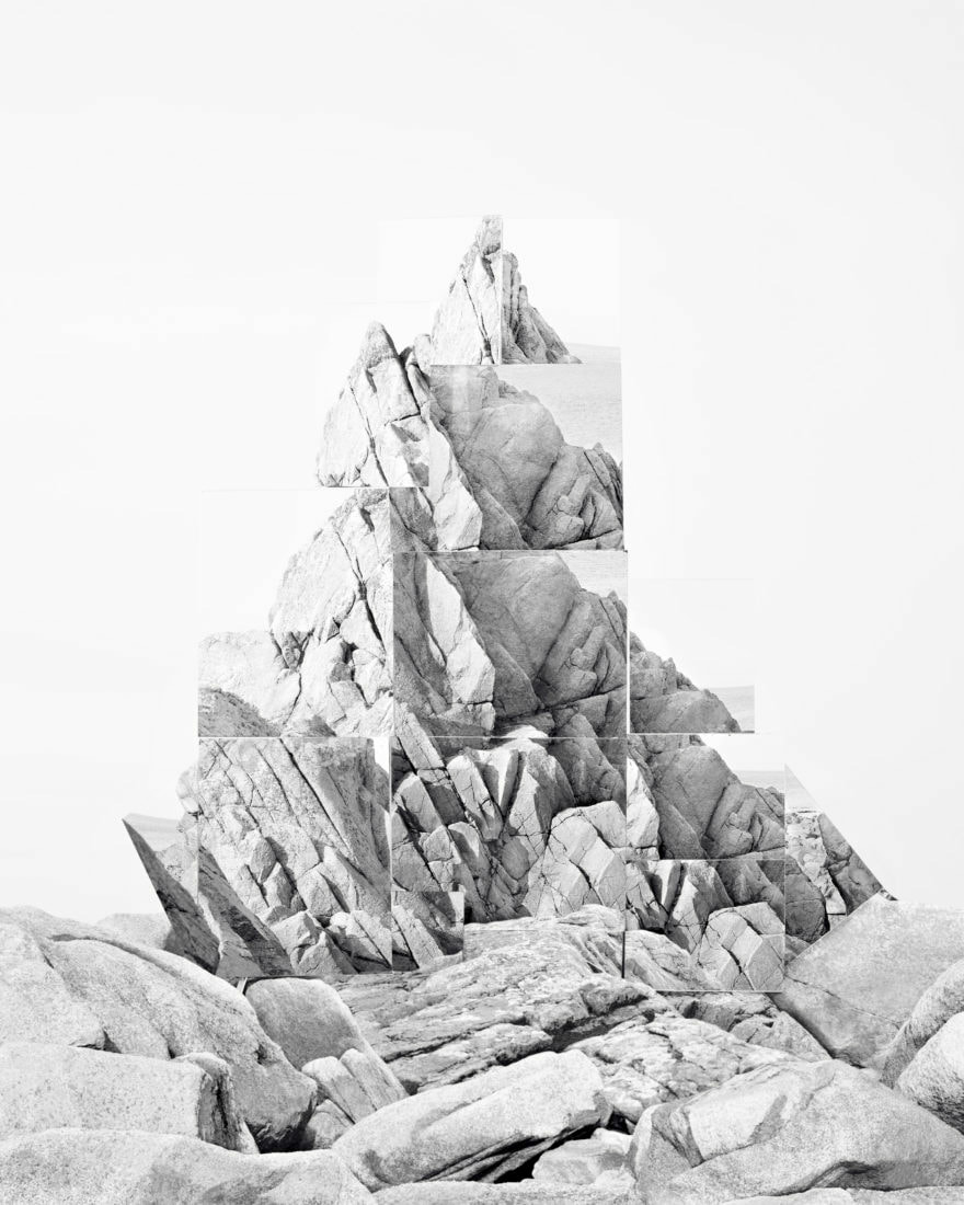
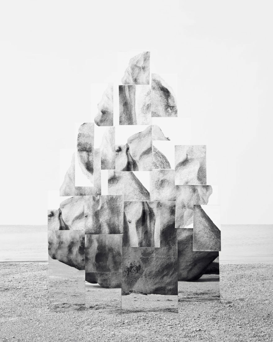
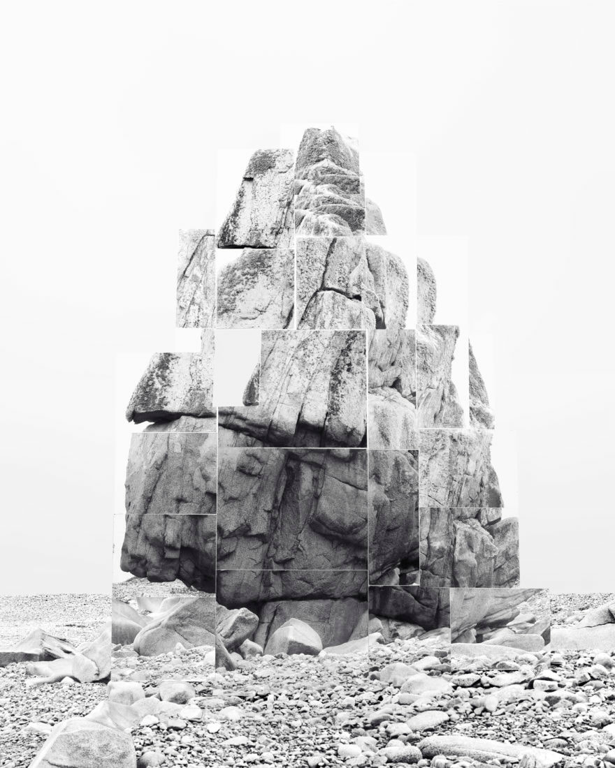
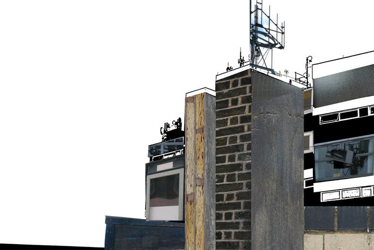
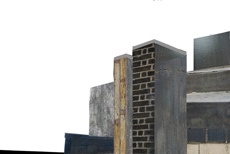
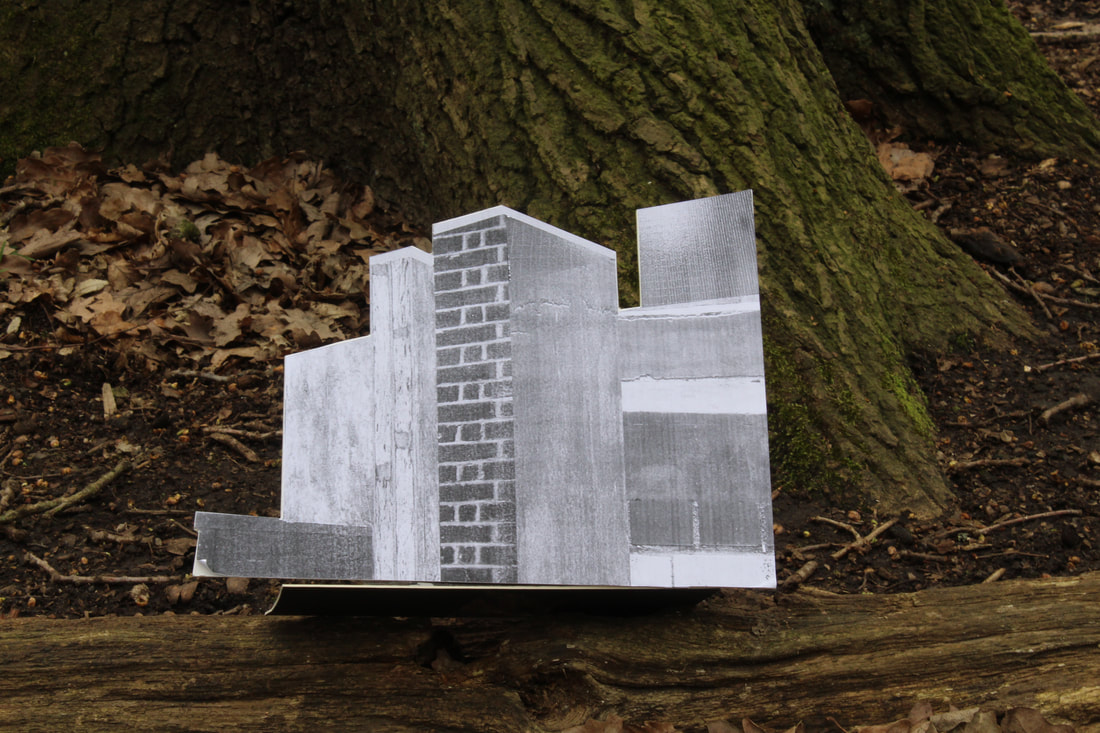
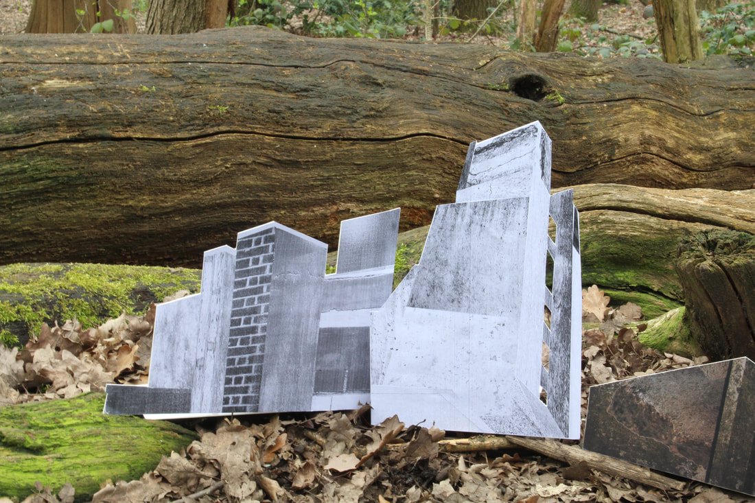
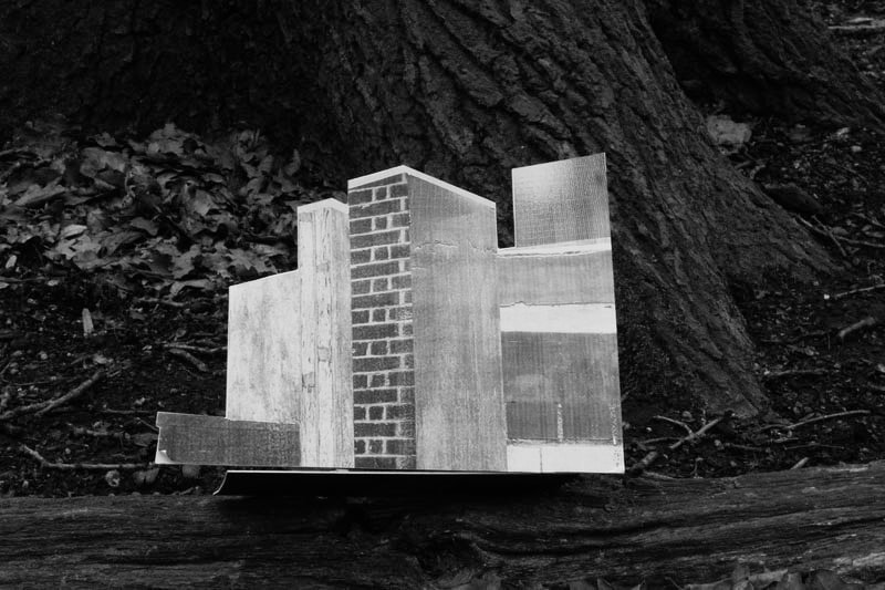
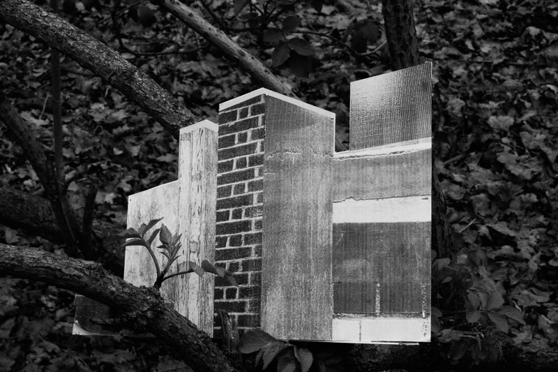
Noémie Goudal is a thirty four year old French visual artist who currently lives in London. In Noémie Goudal’s Soulevement series, she creates images of rock formations which turn out to be photographs of sets of mirrors installed in the landscape. The meaning behind the series, is an investigation into photographs and films as dialectical images, wherein close proximities of truth and fiction, real and imagined offer new perspectives into the photographic canvas. Using the work of Goudal, I am going to create my own response by looking at the idea of breaking something apart to make something new. To do so, I will use an image of an existing building structure I have already taken, and then take multiple other closer up photographs of landscapes to create a new structure. I will then use Photoshop to construct a new infrastructure by cutting out bits of my photos and layering them onto the original building.
Goudal:
|
|
|
My Response:
First response
Second response
Into the woods:
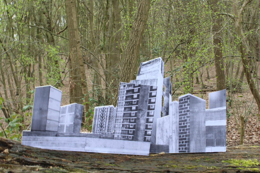
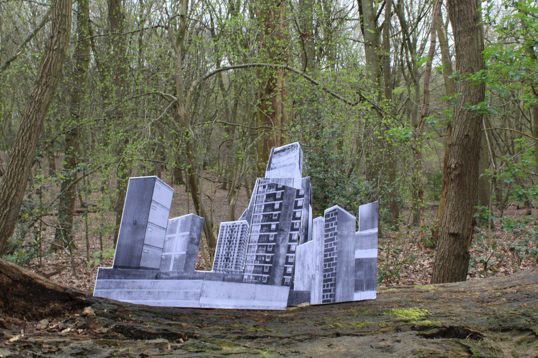
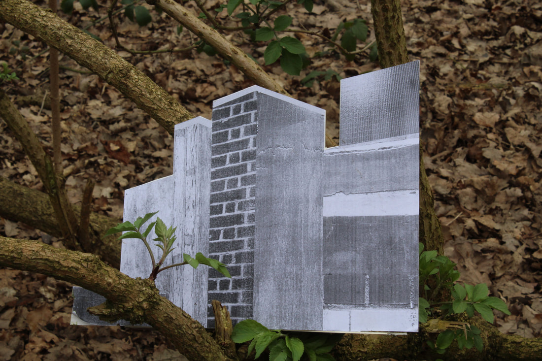
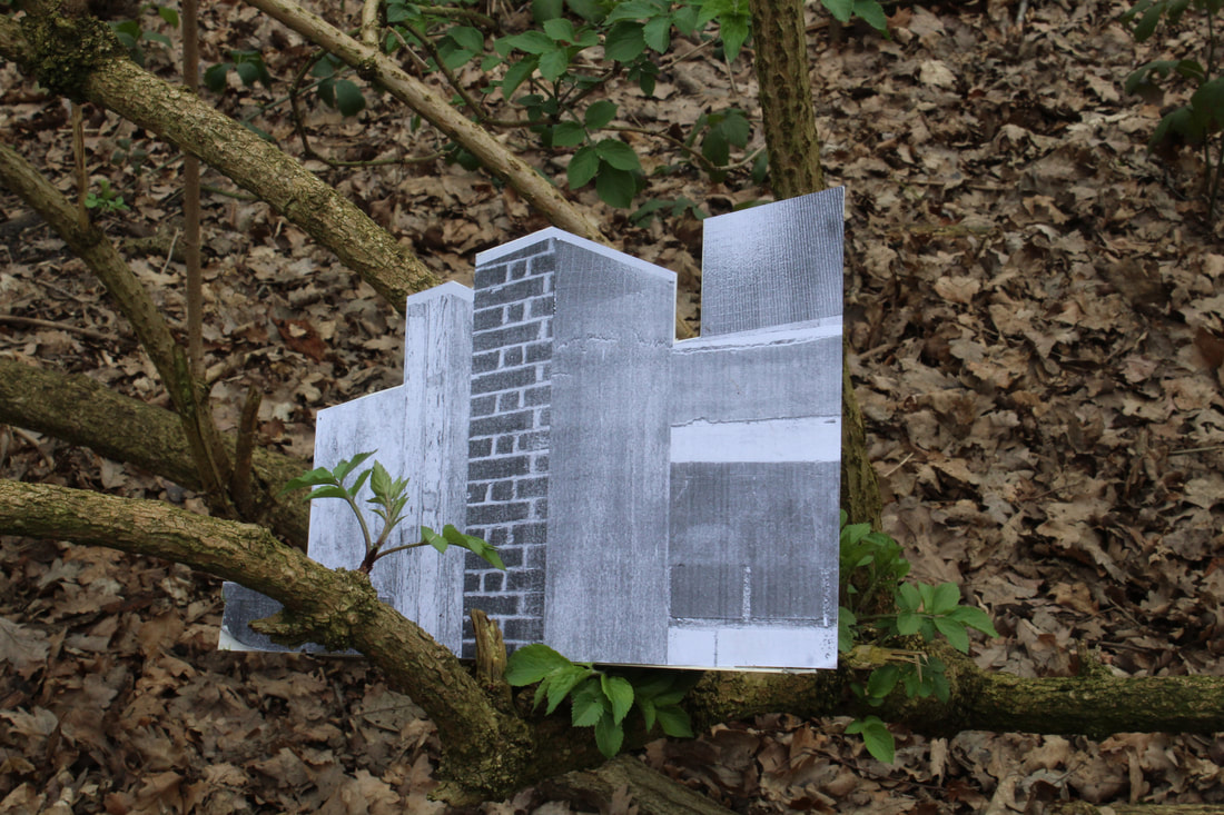
As part of my response to Goudal, I printed off the infrastructure that I created on Photoshop and took it out into Coldfall woods. This was to explore the idea of variation in different landscapes. I edited a couple of images on Photoshop in order to experiment with creating a different aesthetic. I did this by changing the image to Graystyle and increasing the contrast. I feel as if the building stands out more in black and white as in colour the trees and leaves take away the spectators focus from the building. Additionally, Goudal's images are highly minimalistic and using Graystyle deploys a similar minimalist aesthetic.
|
|
Shadow and Light Variation:
Valerie Kabis is a photographer who is currently living and working in Moscow, Russia. Kabis is interested where shape is created by the restriction of light. By experimenting with light and shadow and experimenting with variations in lighting Kabis creates a series of dark and haunting images that almost wrestle with a world beyond the physical. To create my own response to Kabis I am going to; experiment with different lighting backgrounds and use different light direction and camera exposures.
|
|
|
My Response:
|
|
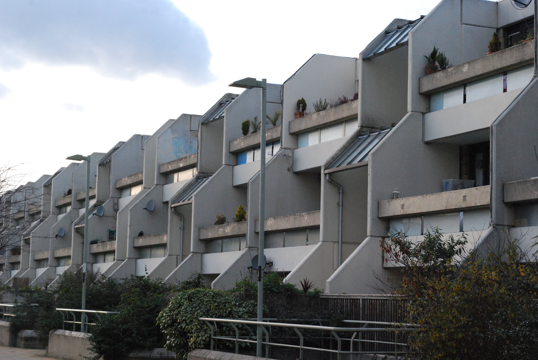
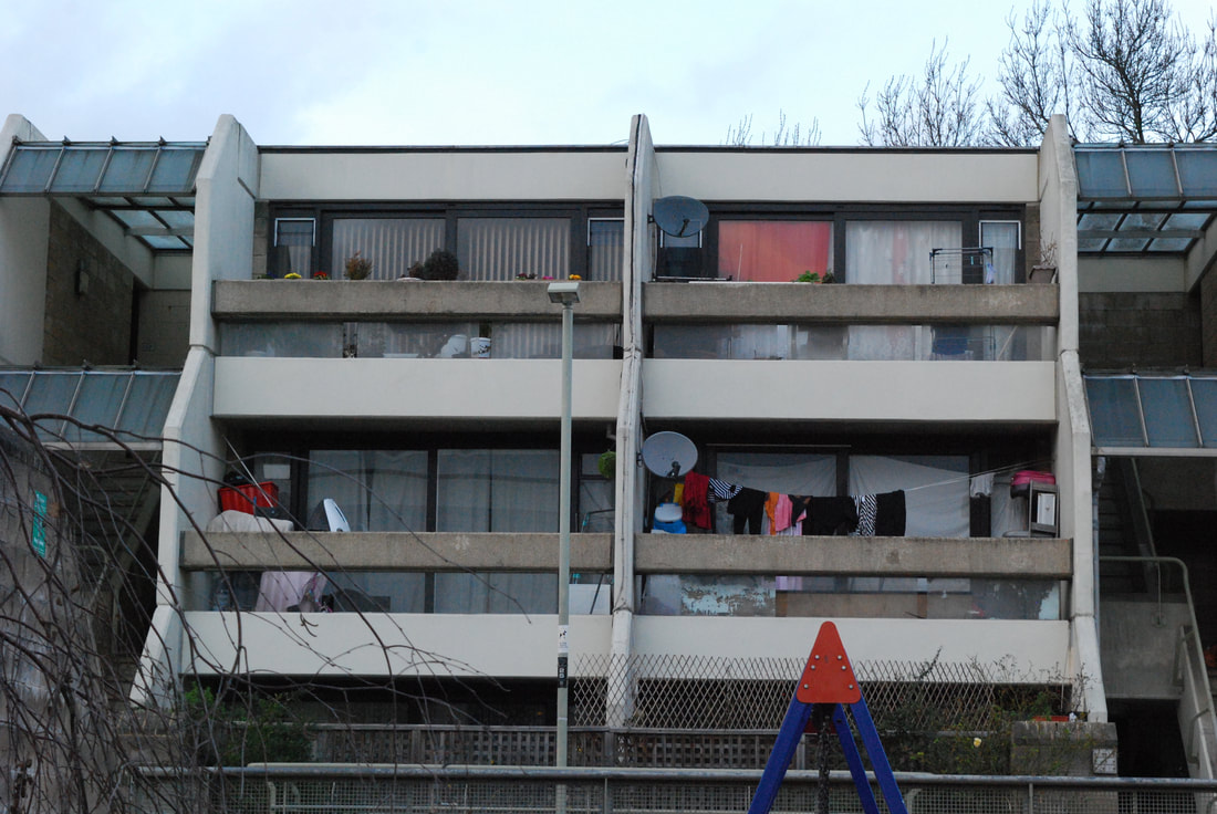
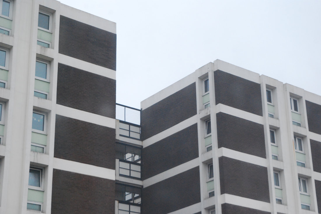
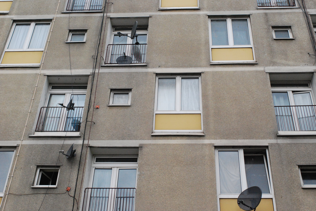
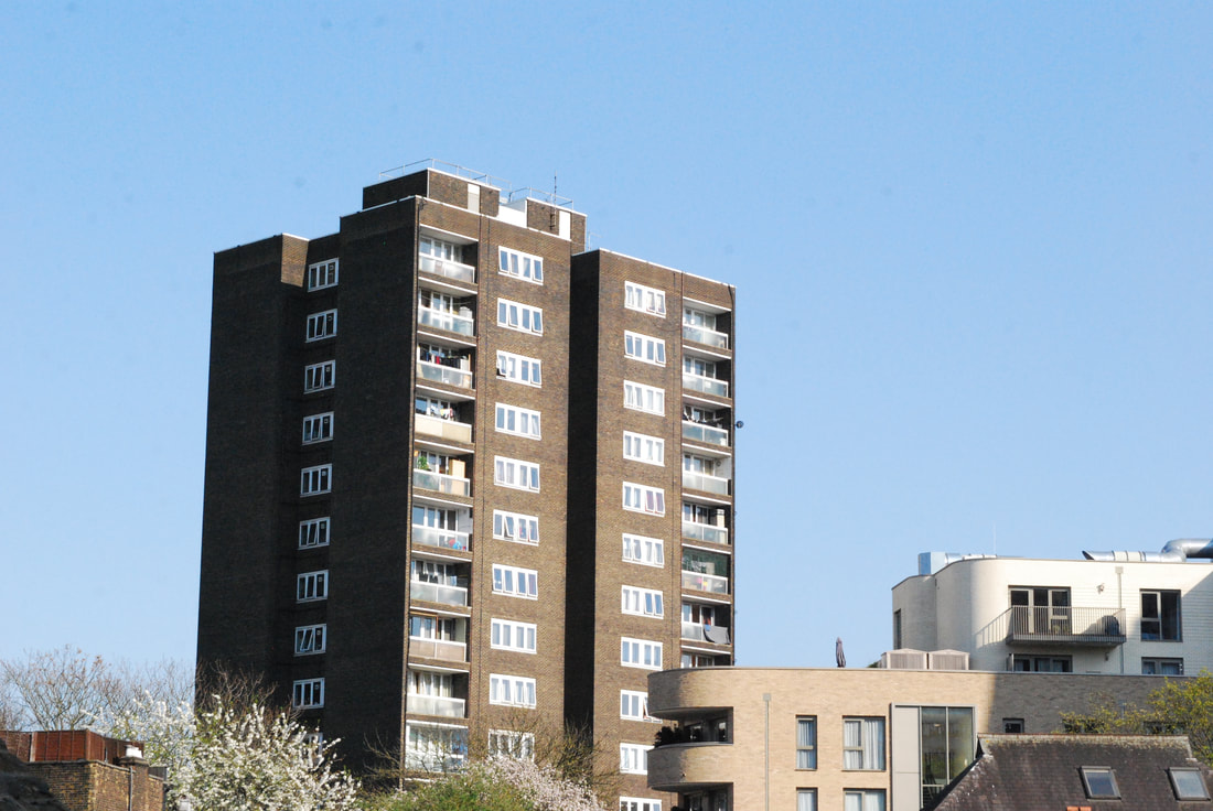
Strand 1- Variation and Similarity within London Housing:
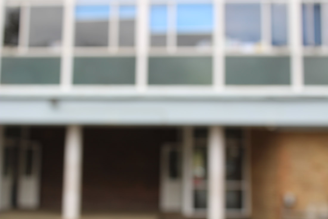
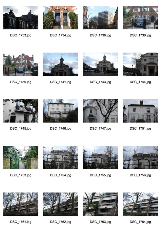
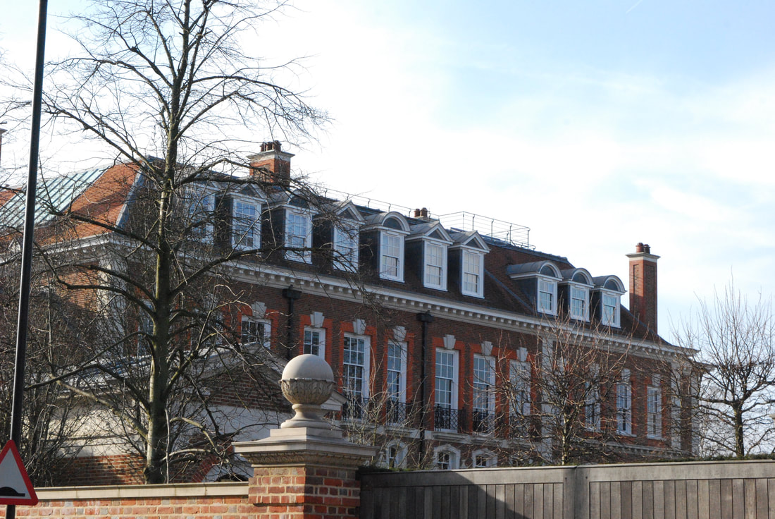
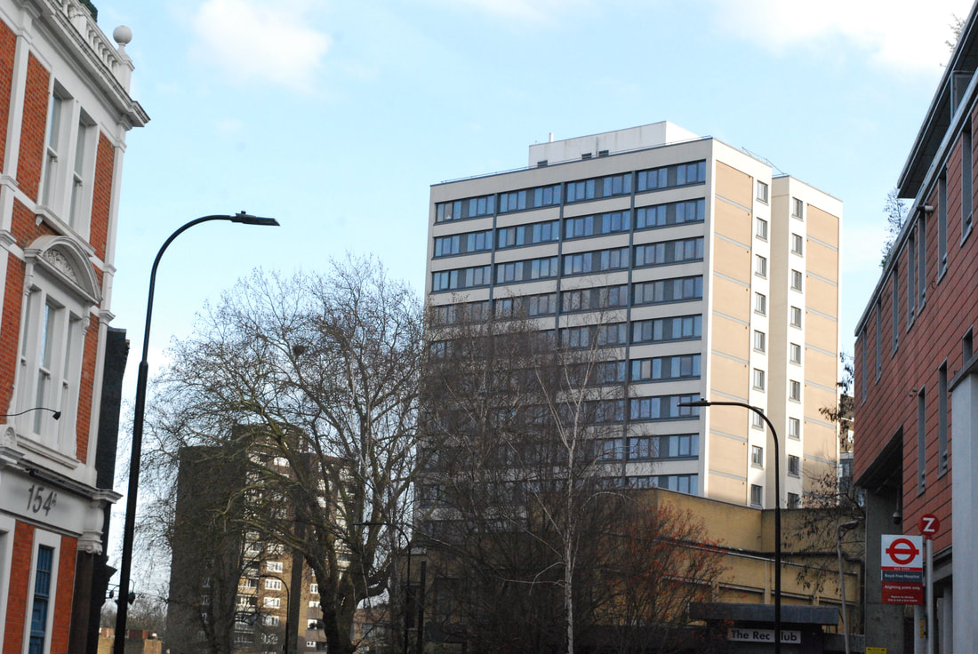
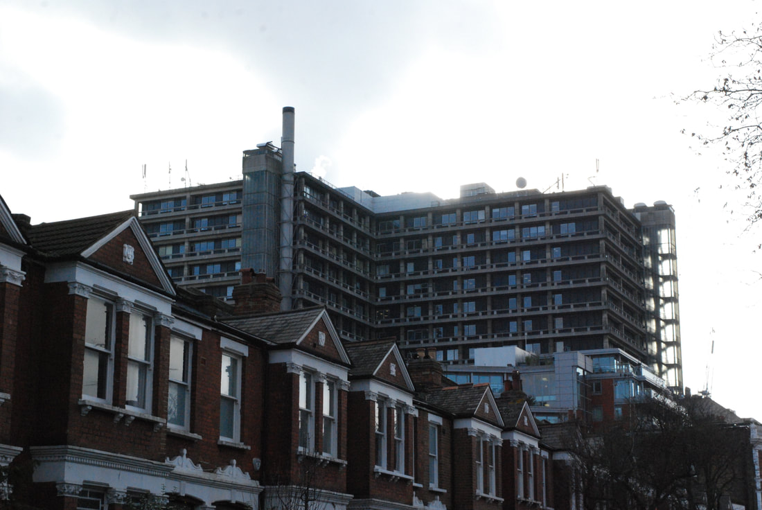
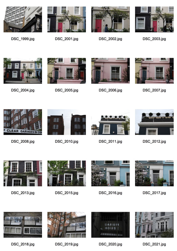
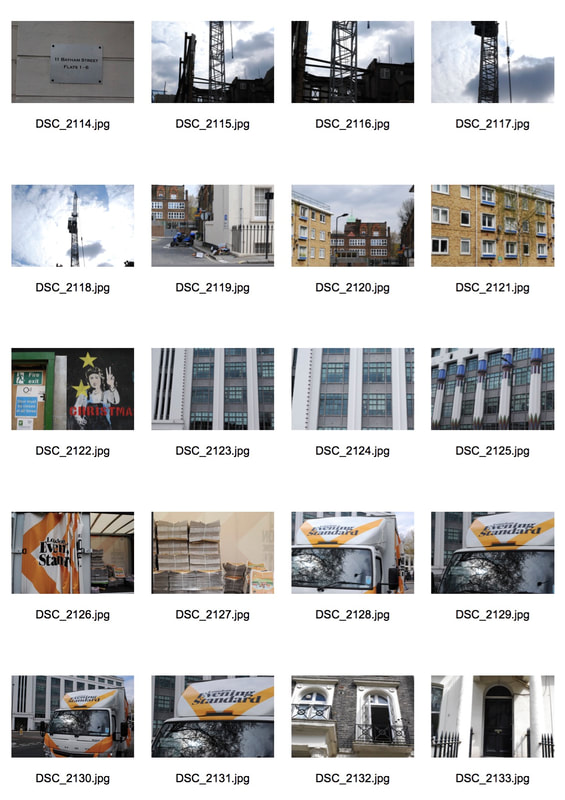
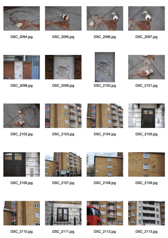
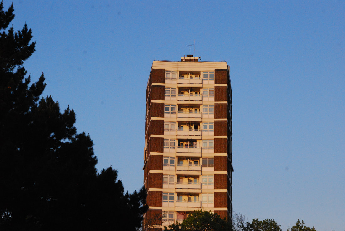
For my first strand I wanted to look at the variation and similarity within London's housing. My aim was to go to different areas around the city and capture the variation and similarity but focusing on the housing within London. I choose this for my first strand as I think the differences in the housing accommodation in London optimises the diversity and inequality in London. I find it fascinating how you can have a couple of houses that are worth five million pounds right next to a council estate. Additionally, how you cram three hundred and fifty people in one block of flats without proper fire protection, such as Grenfell Tower in West London, yet have a whole road such as Bishops Avenue in North London with multiple mansions uninhabited for. Throughout the process I will be using my digital camera but, I may experiment with a film camera as I have never done so in any of my units. I am planning to go to at least one area in North, East, South and West London in order to get a true variation of London's housing.
Highgate, Hampstead & Archway:
|
|
|
|
Highgate:
|
|
Hampstead:
|
|
|
Archway:
|
|
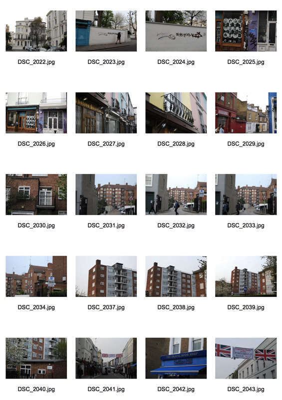
Market Road & Kings Cross
|
|
|
|
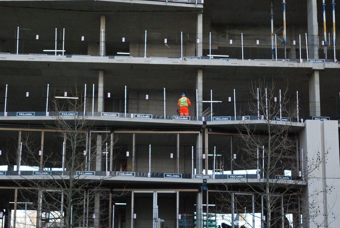
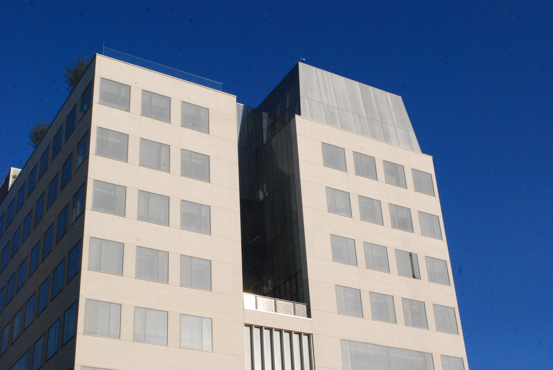
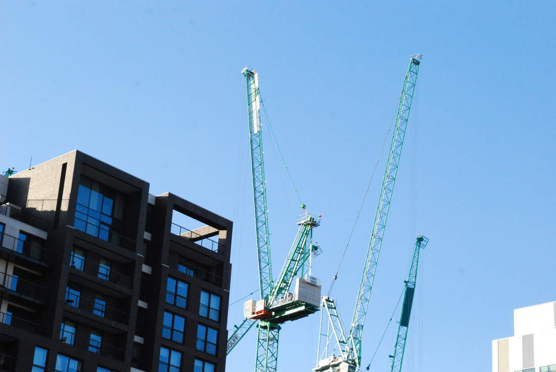
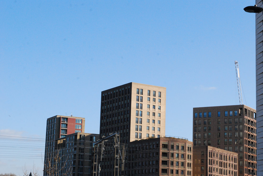
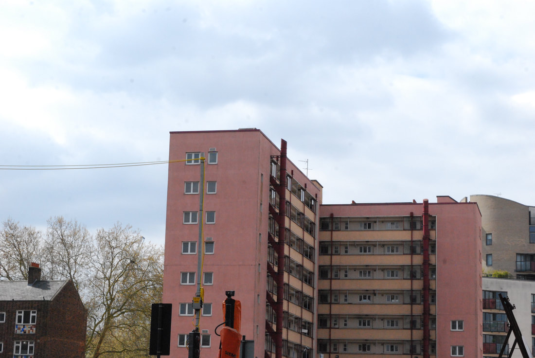
Kings Cross is one of London's most prominent locations of regeneration and new developments. With a constant expansion of high rises and buildings still being built, Kings Cross has totally changed since its birth. I walked along from Market Road to Kings Cross tube station to capture how far the location has changed and how this has impacted the variation of living spaces within the area. For example, Broadfiled estate which has been regenerated to fit in with the new, modern infrastructures. Some of the original blocks are still standing but have been adapted to fit in with Kings Cross's new image. I then went up a public viewing platform which was perfect for showing the variation and similarity within the area as it showed the old train station and old infrastructures which were being taken apart, combined with builders and new buildings being created. The sunlight was perfect and the sky had hardly any clouds and thus was bright blue which made the modern buildings (which were all the same colours of creams, beiges and browns) largely striking. My camera must have been dusty as there are slight blotches on the images and the picture is not as crisp as it usually is however, I actually liked this as it gives the digital images an almost film-like look.
Selects:
|
|
|
|
|
|
|
|
|
|
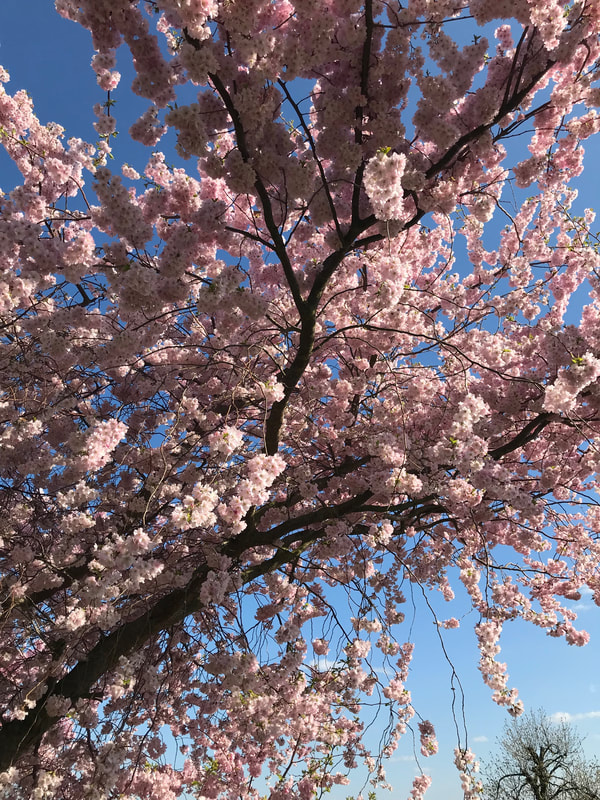
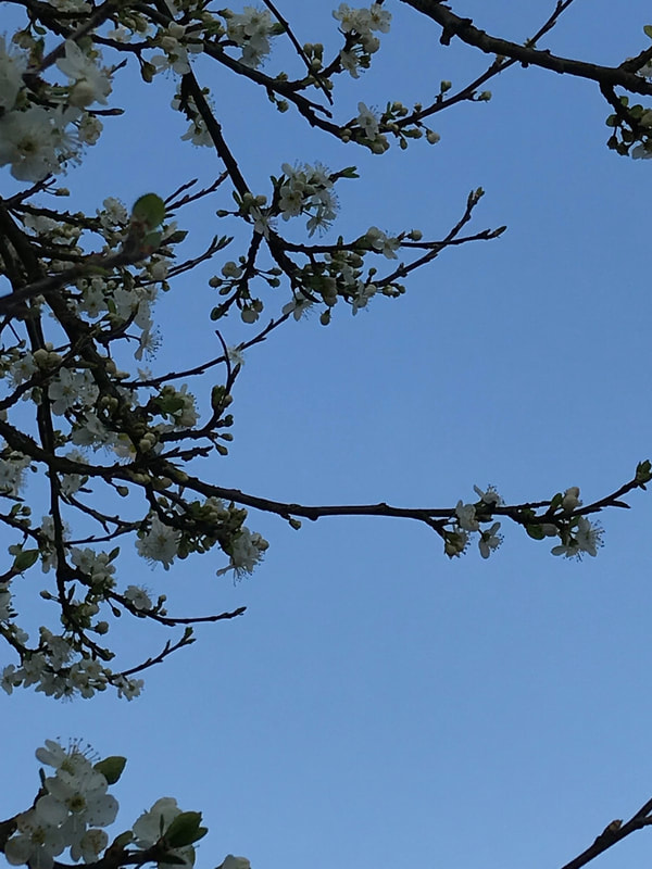
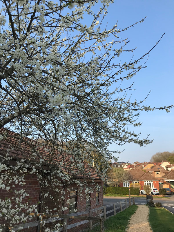
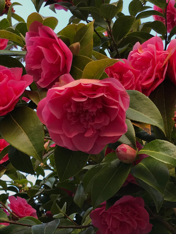
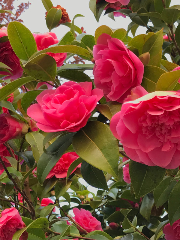
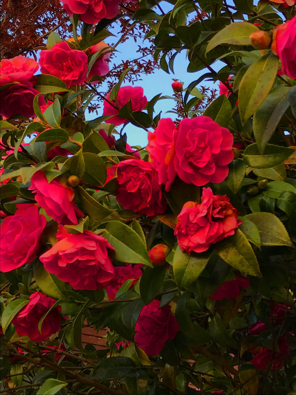
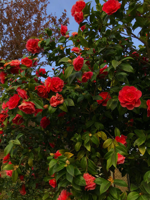
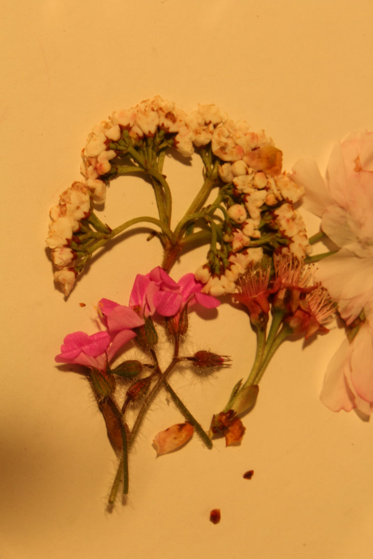
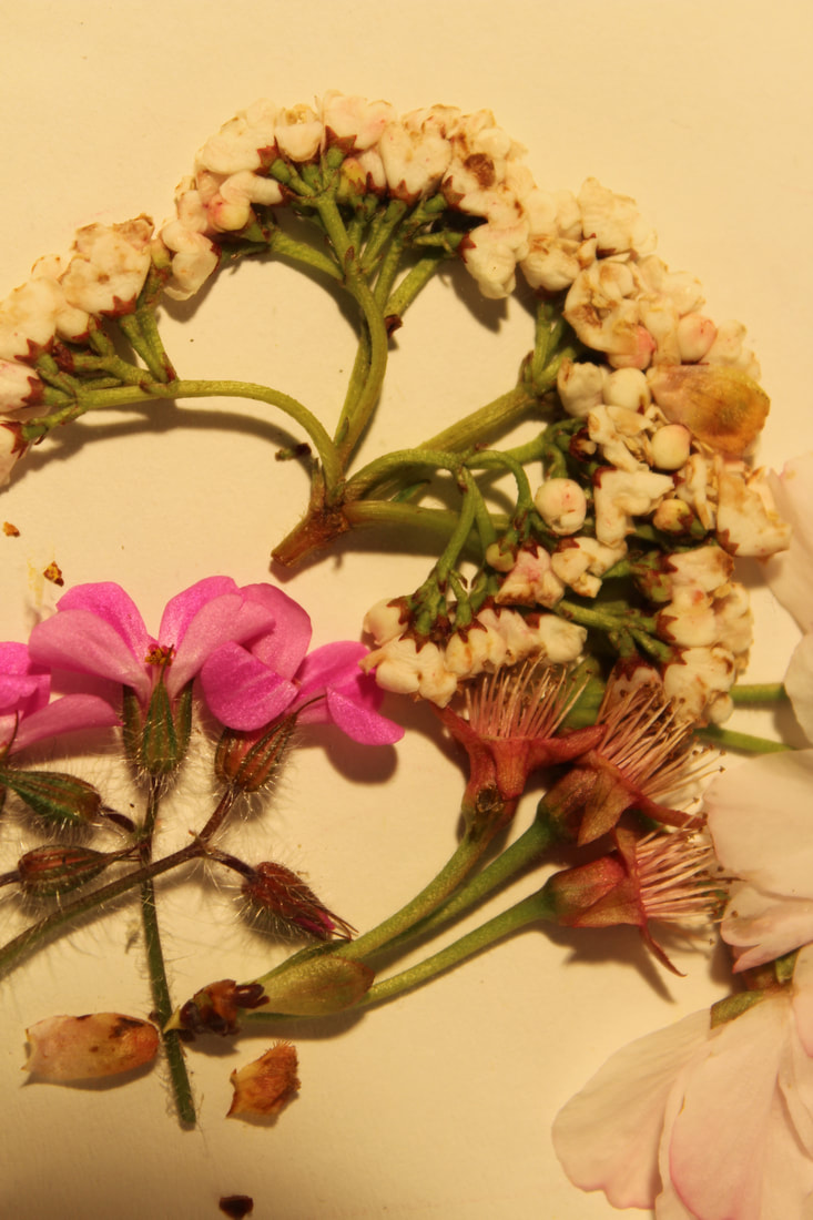
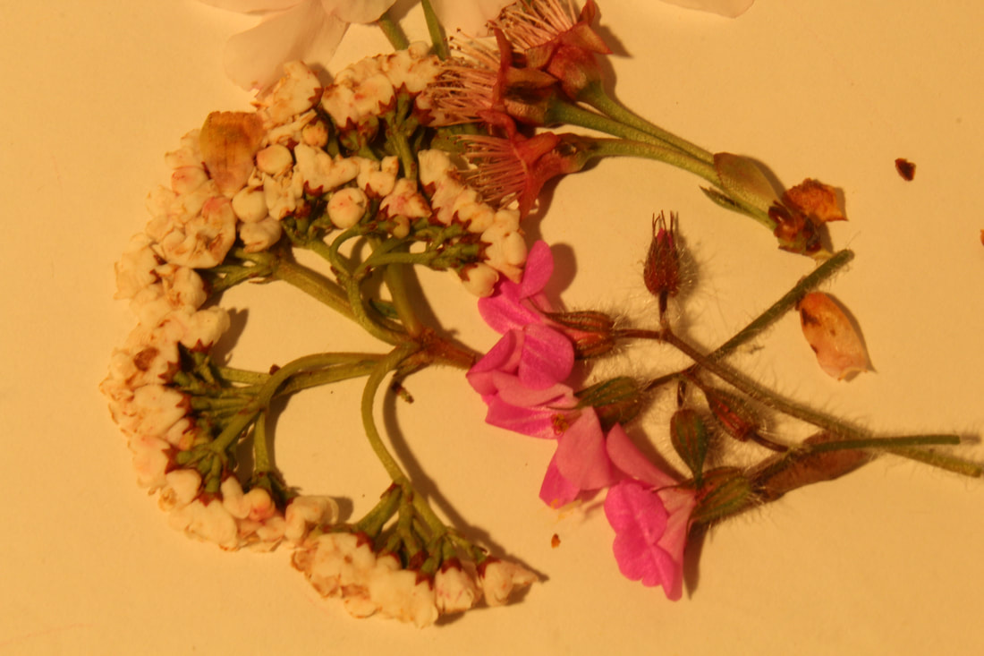
Strand 2- Variation within flowers
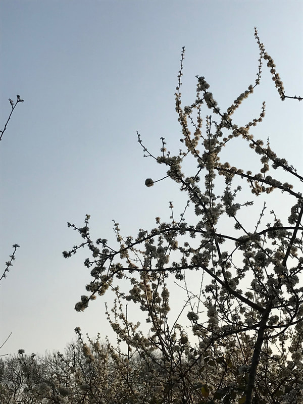
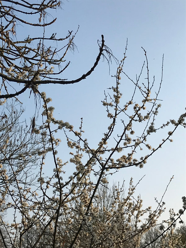
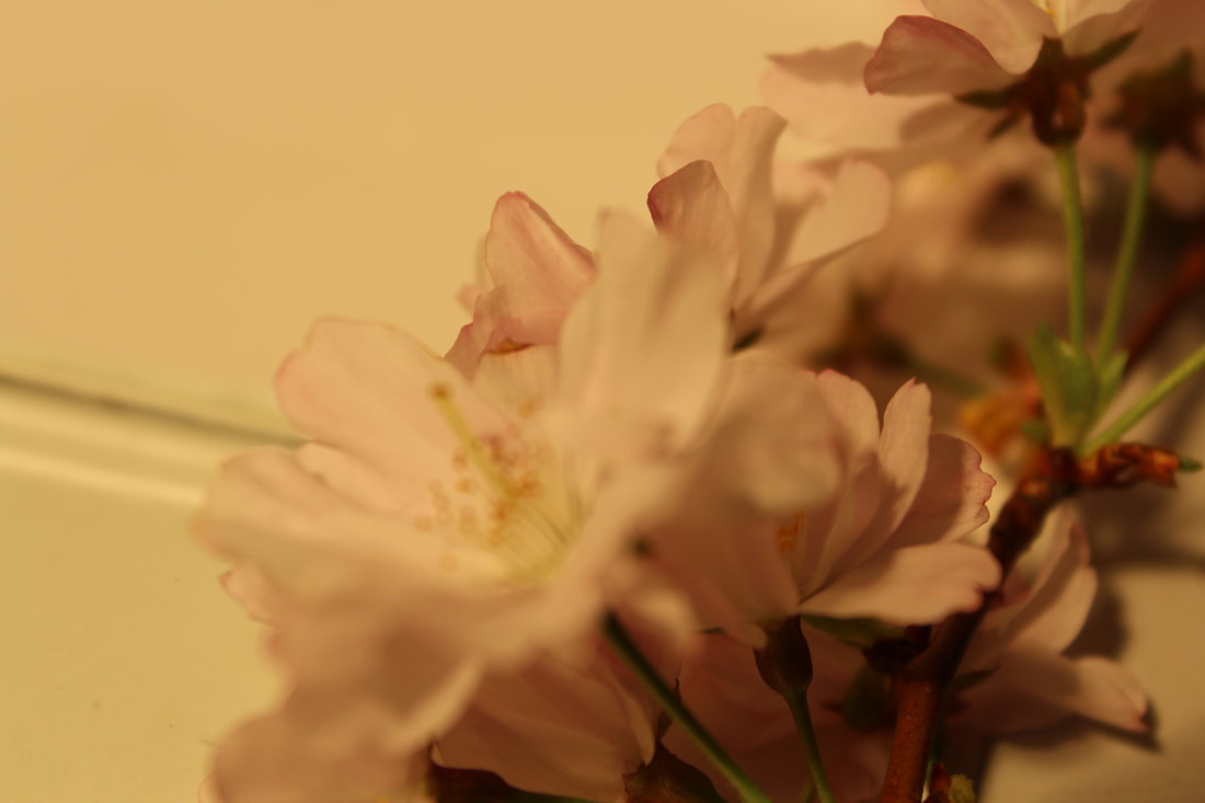
For my second strand I chose to do the variation within flower and as it is coming up to Springtime it is the perfect time to capture all the newly blossomed flowers. Technically a flower is the reproductive portion of any plant in the division Magnoliophyta, a group of plants also known as angiosperms. There is more than 300,000 species of angiosperms and thus flowers are a perfect example of variation. I am going to use my iPhone instead of my camera for this stand as my phone zooms in closer and I actually feel as if it gives a crisper image then my camera.
Ally Pally
The first location I decided to go to was Alexandra Palace. The sunlight was perfectly bright on this day and there was hardly any clouds in the sky. The clear blue sky provided as a perfect canvas for the pink leaves, almost enhancing their colour.
|
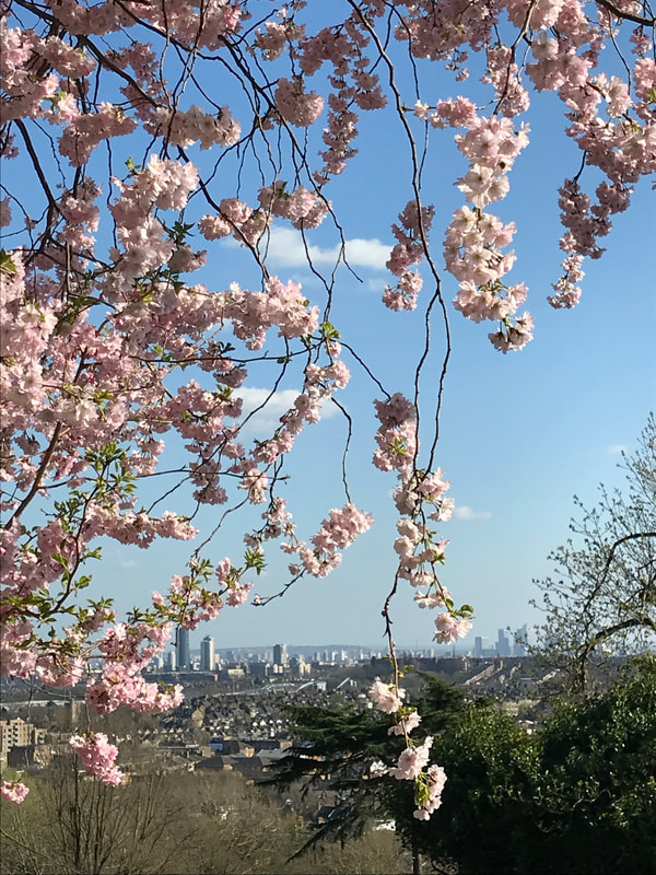
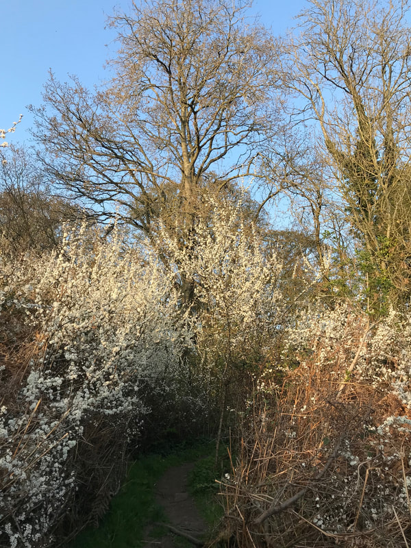
For this image, I used a technique I picked up on the trip walk, I took a photo of the city almost through the perspective of nature. I really liked how you could see a portion of London through the gap in the branches and felt like it reinforced variation as its a reminder of how much other life there is. Additionally, I feel as if combining nature and the man-made in one image also reinforces the variation within life as it reflects how thousands of different beings coincide.
|
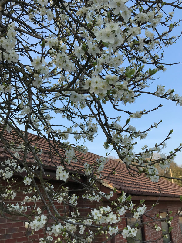
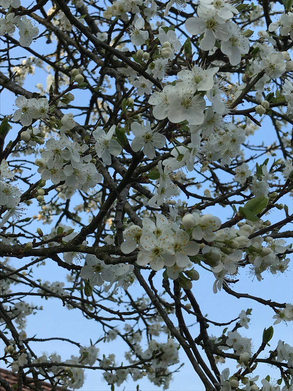
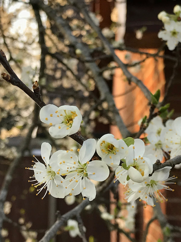
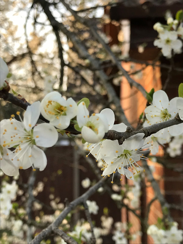
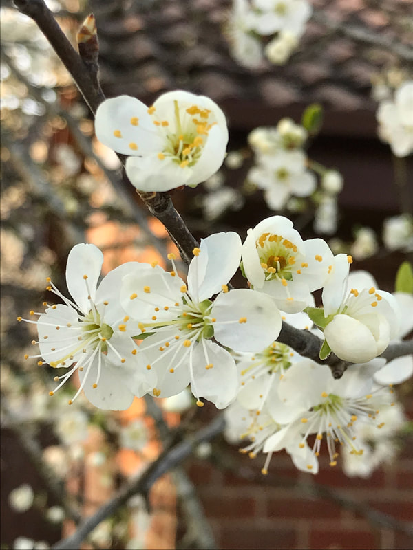
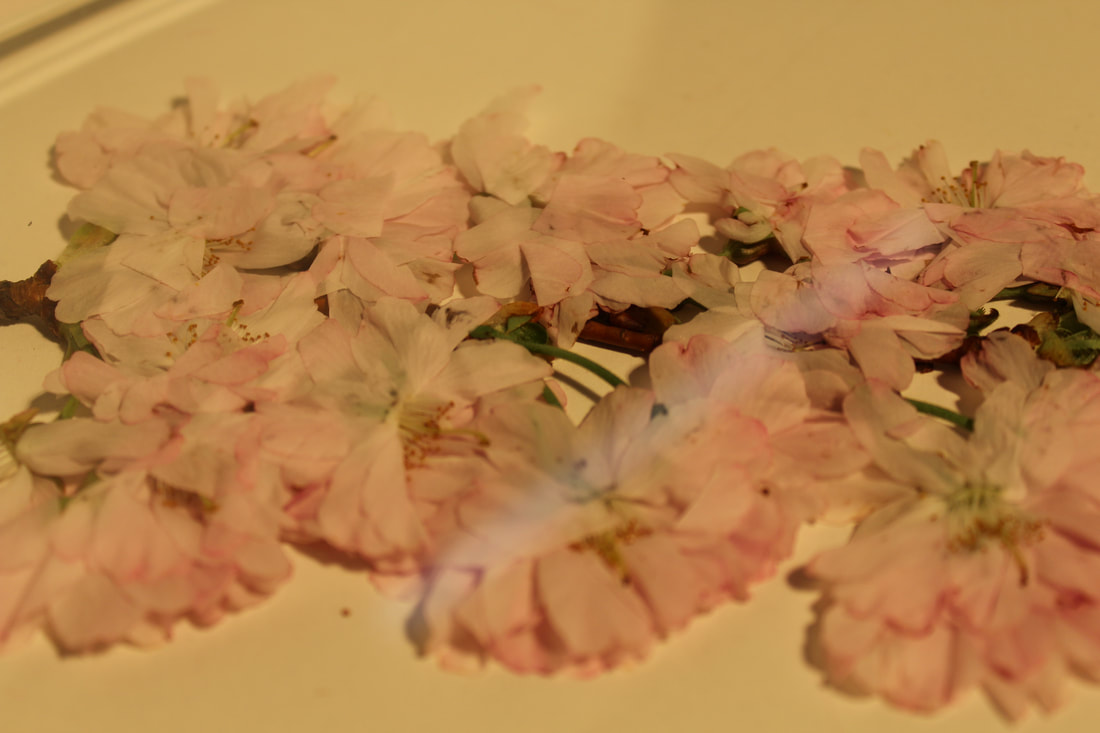
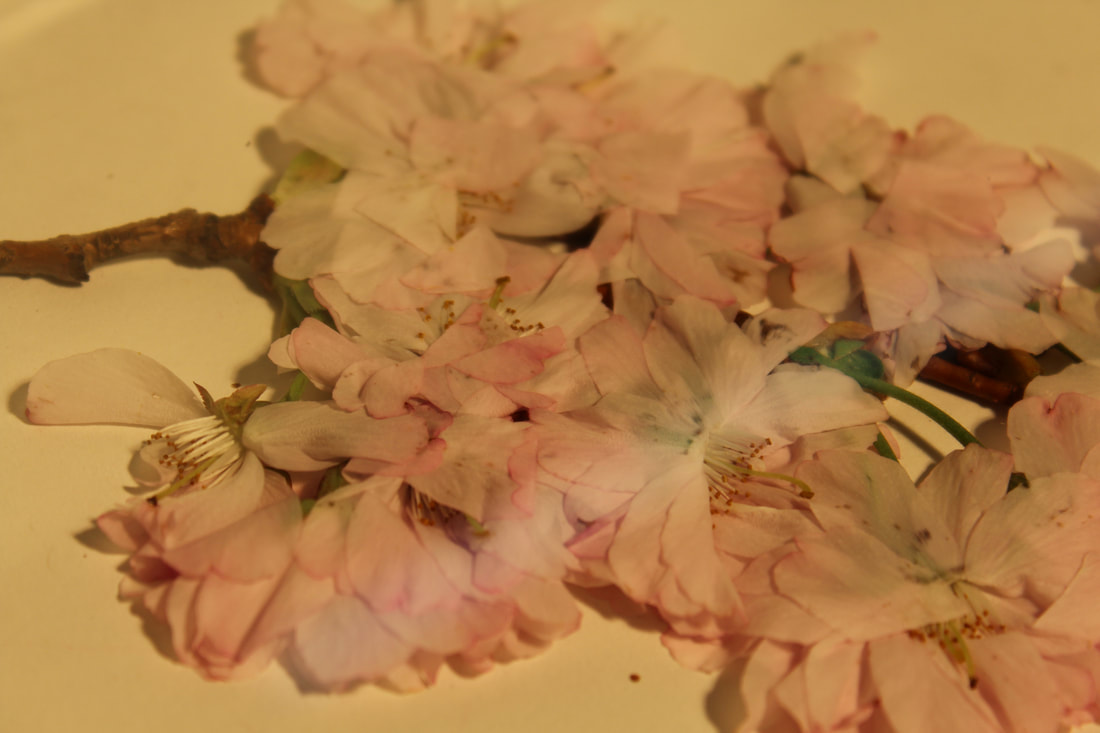
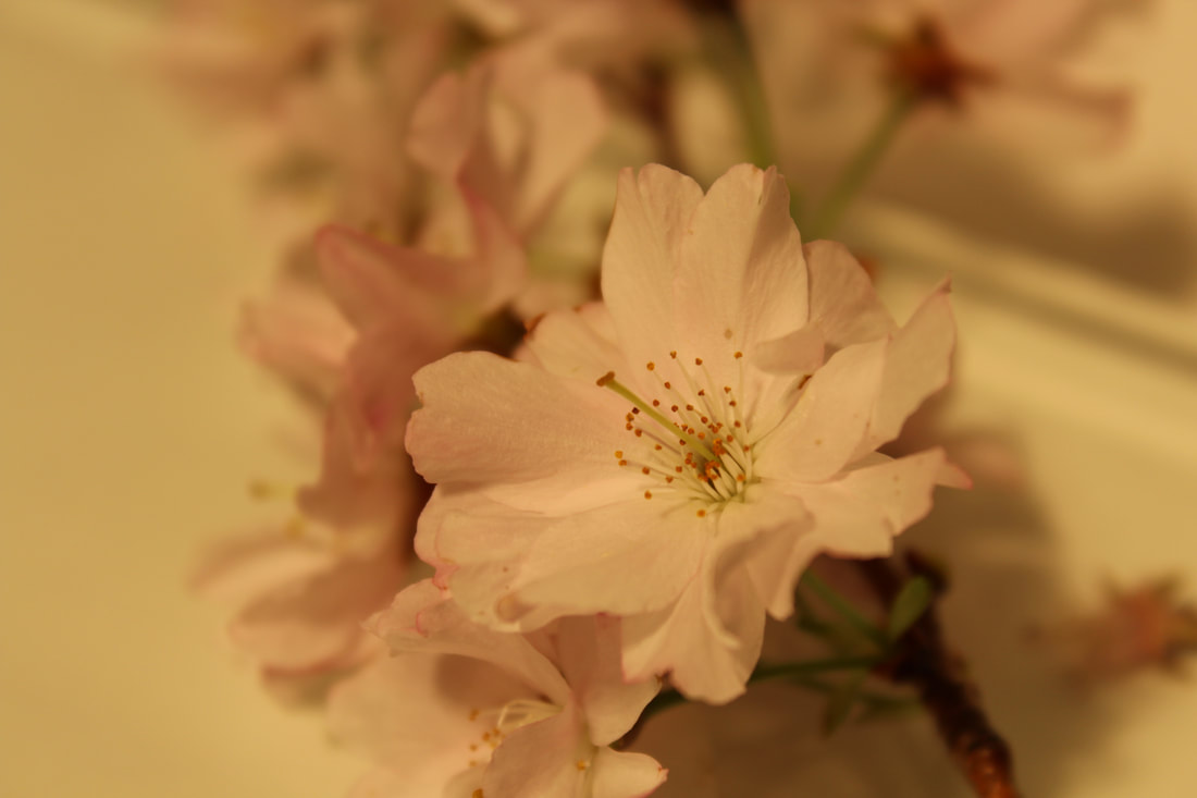
Portsmouth
The second location I photographed was a woods near my Grandparent's house in Portsmouth. I used my iPhone and once again the sky hardly had any clouds which provided as a perfect backdrop. On the last two images of the rose bush I used Photoshop to enhance the hue of the colour red to make the images bolder as the colour seemed a little washed out on my phone. A technique I find I am frequently using is close up angles of the corner of structures. This is a technique I learnt during the 'brutalist' project while I was focusing on negative space. I like the way the flower fills the frame using the 'negative space' technique as its almost half flower half sky. This is the final location I will photograph for my second strand for variation within flowers before going onto typology.
In the studio:
|
|
|
I brought some flowers back into the studio as I wanted to capture the variation all compressed in one image. I used a thick piece of glass and placed a few different flowers underneath. I also had a studio light behind me which created subtle reflections onto the flowers. However, my white balance on my camera was not set to tungsten light which meant my images are too yellow. Additionally, I frequently had to move the lamp behind me to take close ups of the flowers which resulted in different levels of lighting between the images.
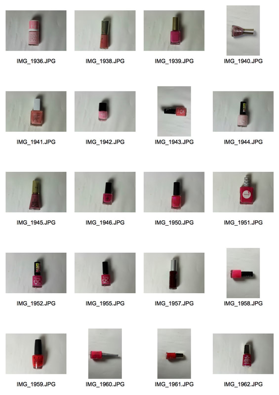
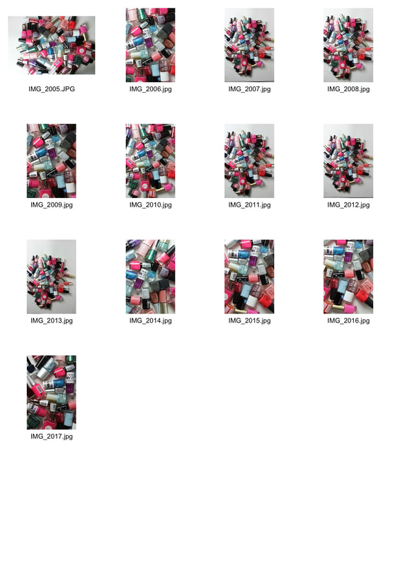
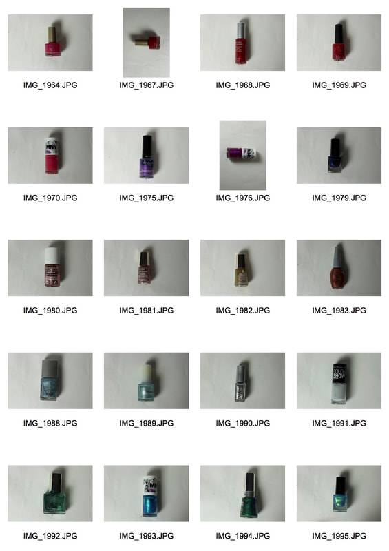
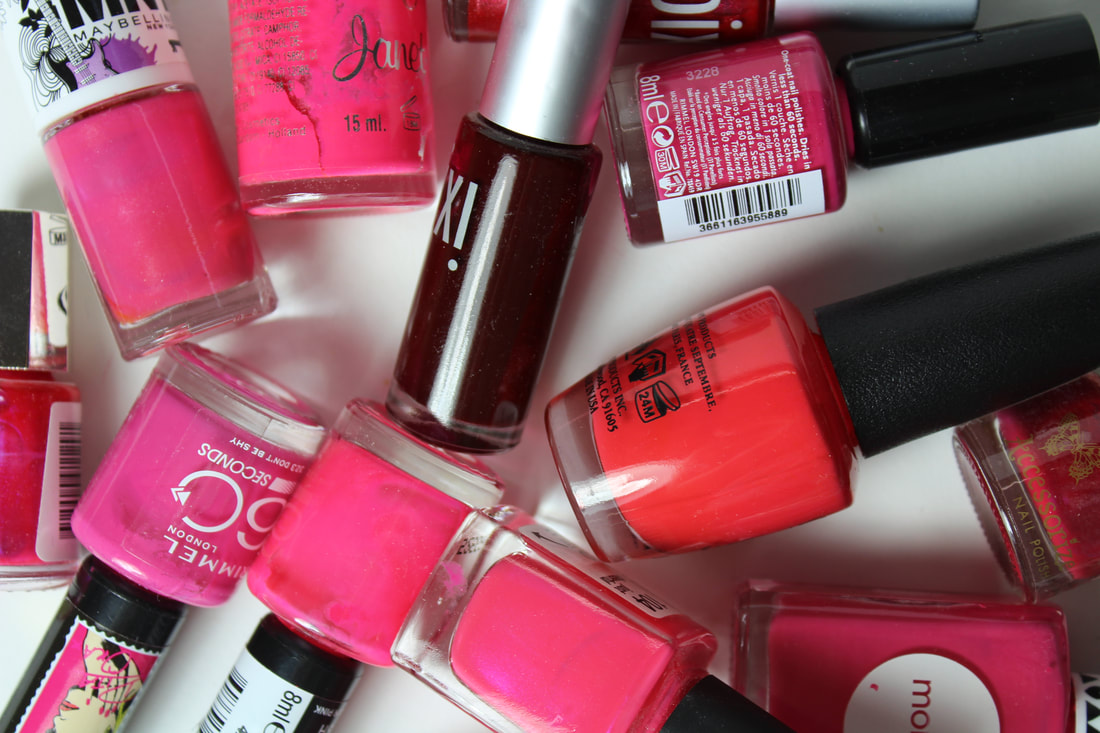
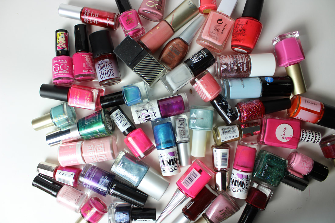
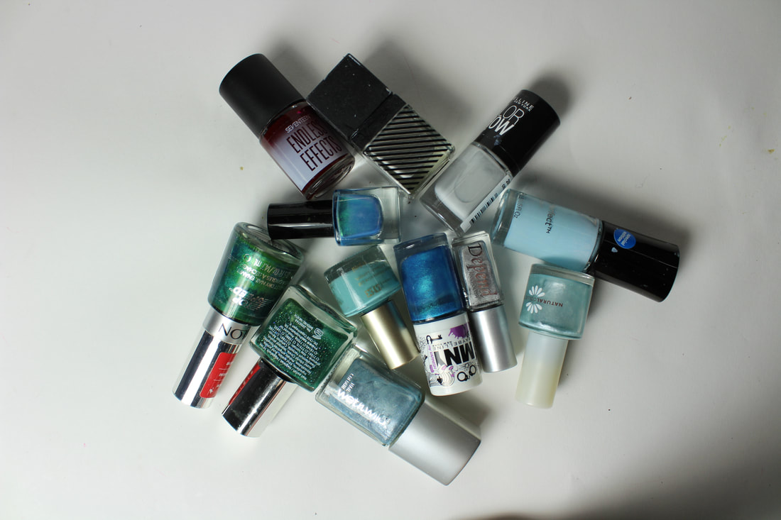
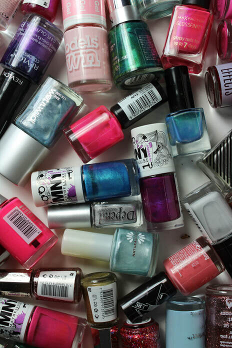
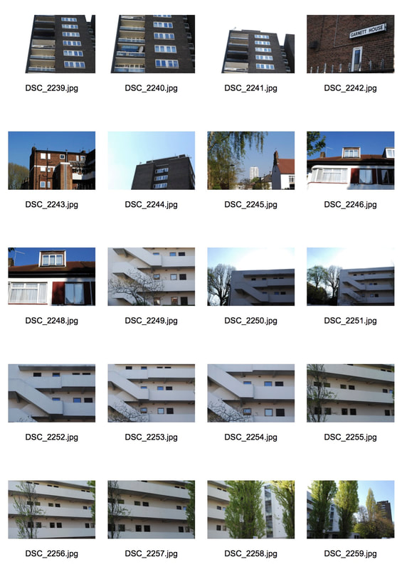
Strand 3- Typology: Nail Varnish
|
|
Selects:
|
|
|
|
I found the typology task interesting and thus chose to do it for my third strand. Because the range of colours of the clips in my second typology task was effective, I came up with the idea to use different coloured nail varnish. I attempted to group together similar shades for example, I started off with light pinks which slowly moved onto darker pinks and then reds, then purple, gold, blue and finally green. I took grouped images of the similar colours which I thought was more effective than the typology images as I found it captured the range of nail varnish stronger, the different colours and shapes were more evident when all bunched together. I placed a small dot on the white piece of paper I used behind the bottles to mark up the centre of the frame so each bottle would be in the same position. However, the main issue I faced was; taking the images from the same distance as each bottle was a different size and thus when each bottle was in the centre of the frame, I had to be either higher up or close to the bottle to keep the images the same size. This also resulted in slightly different lighting in each image as I would either be closer or further behind the lamp which was shinning on the bottles. However, I was ulitmatley happy with the typology images as even though, there were issues with sizing and lighting, the overall contacts are bold due to the bright nature of the colours I picked and the bright lamp I used.
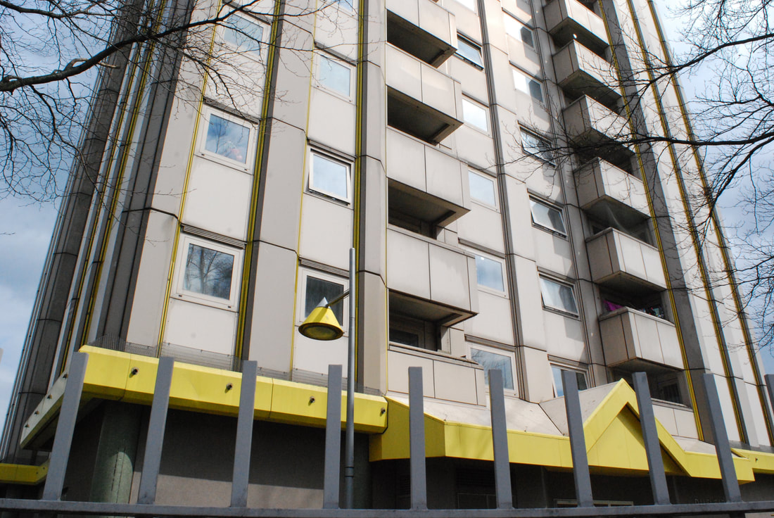
Chosen Strand- Variation and Similarity within London Housing
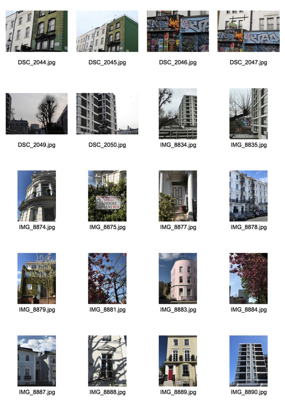
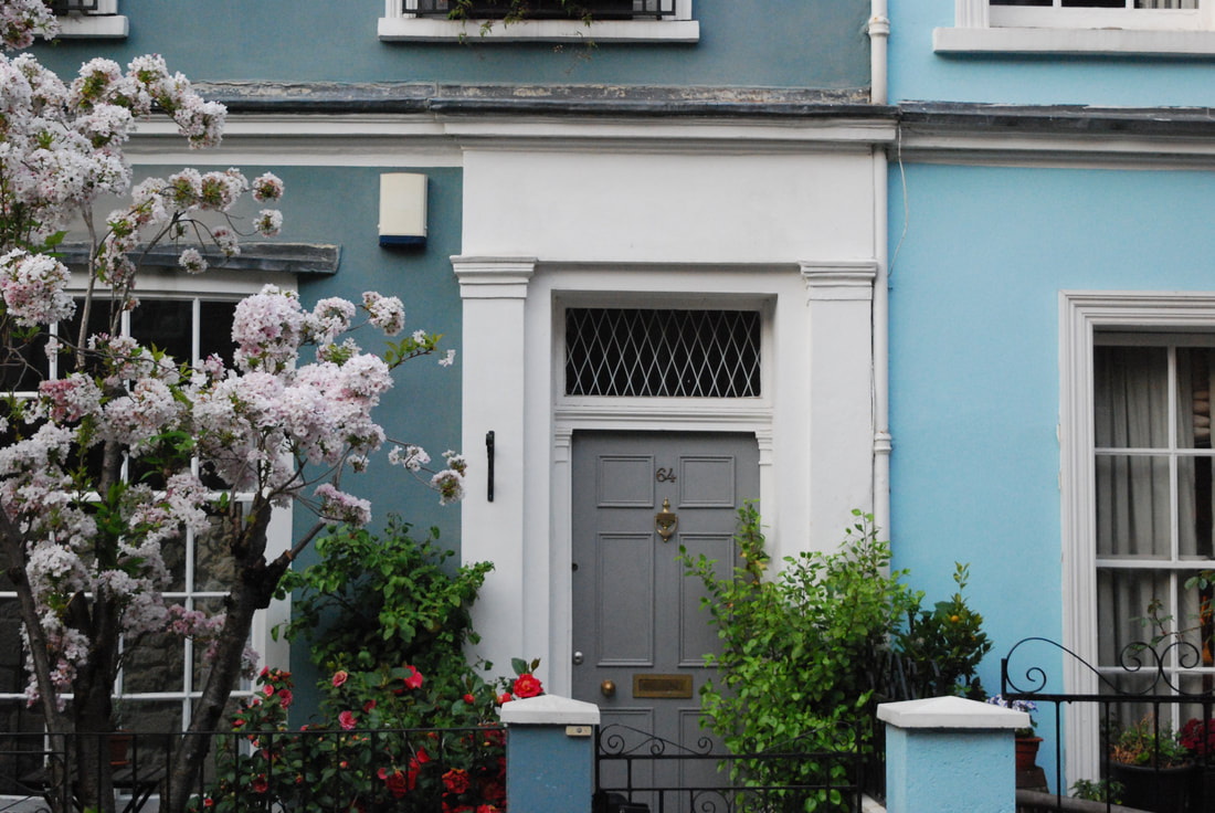
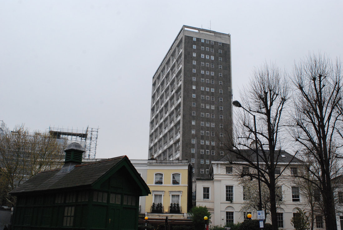
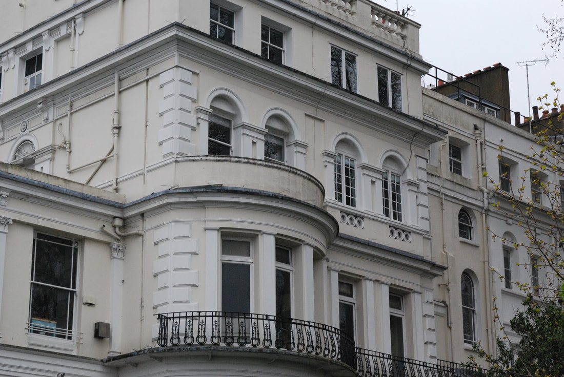
Ladbroke Grove, Notting hill, Holland Park:
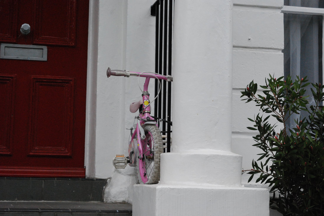
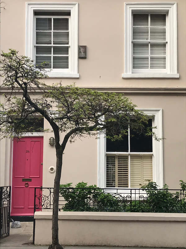
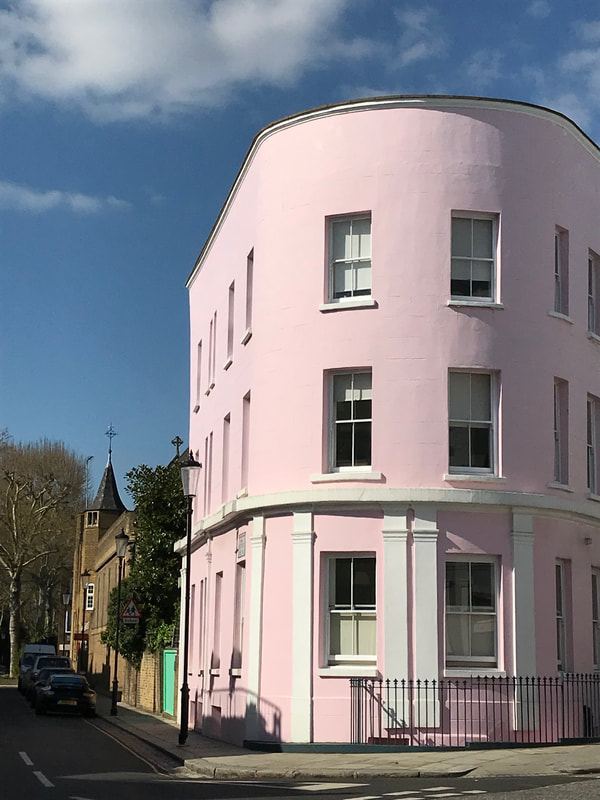
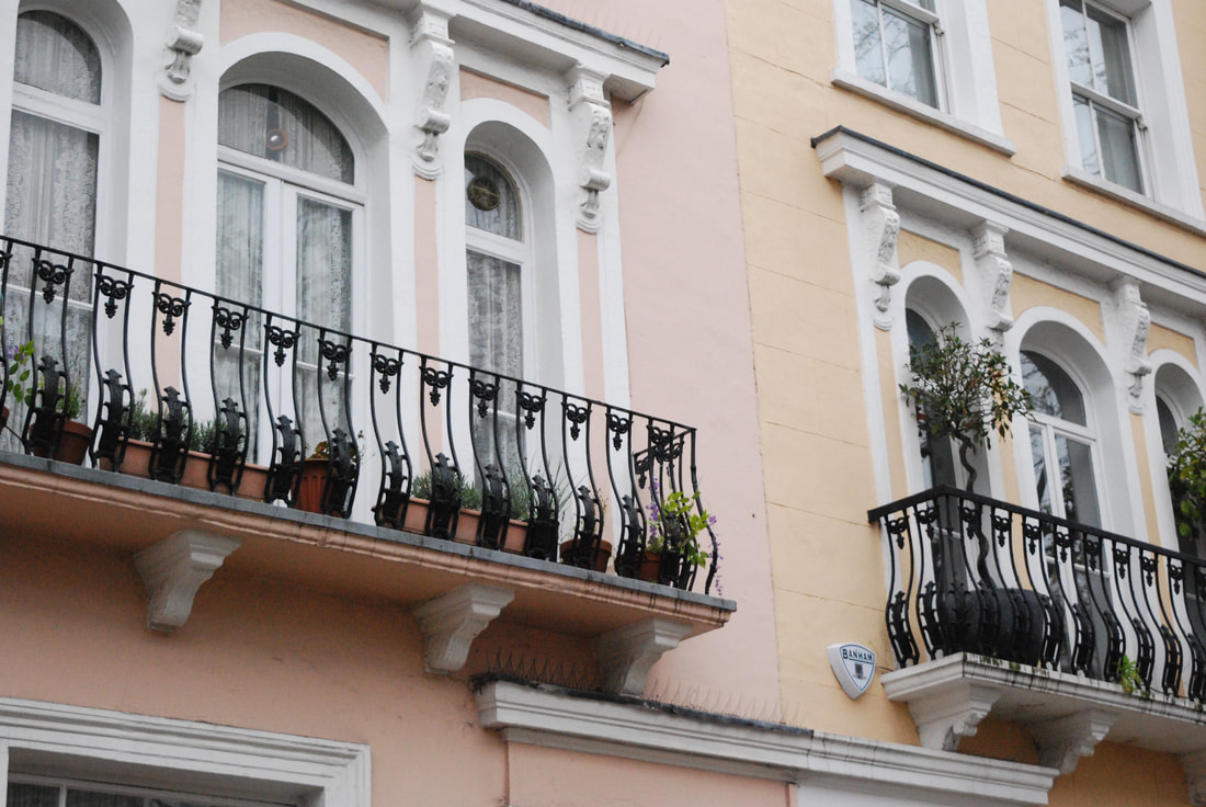
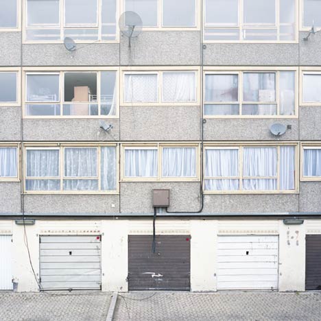
My chosen strand is 'variation and similarity within London housing' however, I will also incorporate typology into this strand as typology will be effective in showing either the variation or similarity within each area I visit. The first area I visited this easter was Ladbroke Grove as I was staying in a family friend's house. Close to half of all residents in the Notting Hill Gate area rent privately (including rent free), almost twice the London average. Only around one in ten of the population live in social housing. The Notting Hill Gate area has a very low proportion of children of school age, and a very high proportion of working age adults (particularly those in their 20s-40s) compared to London. The proportion of older people is similar. I stayed in Notting Hill for three days but unfortunately the weather was grey, cloudy and rainy on the first two days and thus the majority of my images have a dark tone however, luckily the last day was sunny with clearer skies so the buildings seem more striking. I used my camera for the majority of the images but on the sunny day I used my phone as the colours seem to emerge more in the pictures taken with my phone. I walked to Notting Hill and Holland Park to get a real variation of housing. Ladbroke Grove, Notting Hill and Holland Park are all right next to each other yet, the mixture of people who live in these areas couldn't be further apart. I noticed how there was so many roads where a run- down housing estate was right opposite decant houses. The colours in the images emphasise this with the majority of the houses being brightly painted with blues and pinks with flowers covering the outside. This strongly contrasts to the dark blacks and greys of the estates with wire and security cameras covering the outside. After my contact sheets and selects I am going to put two images of different housing which were on the same street to emphasise the juxtaposition of the housing in Ladbroke Grove, Notting Hill and Holland Park.
|
|
|
|
|
Selects:
|
|
|
|
Same Street housing:
Ladbroke Road
|
|
Nottinghill
|
|
Artist and Me:
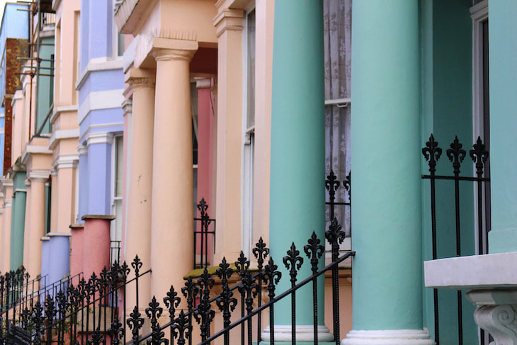
Pastel hues on Westbourne Park Road- Nick Walker 2015
|
My Image
|
An artist that inspired my Notting Hill photos was photographer Nick Walker. Nick Walker is from Cornwall, Uk and is a wedding photographer, but I found this image taken by him in Notting Hill and really liked it. I also found his image very similar to my style of capturing structure such as the way he fit the houses into the frame. So much of Notting Hill is filled with colour and Walker's image of the multiple brightly painted houses on Westbourne Park Road really captures this.
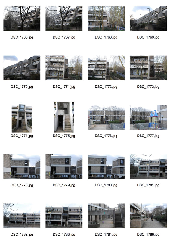
Camden, Mornington Crescent, Oxford Street:
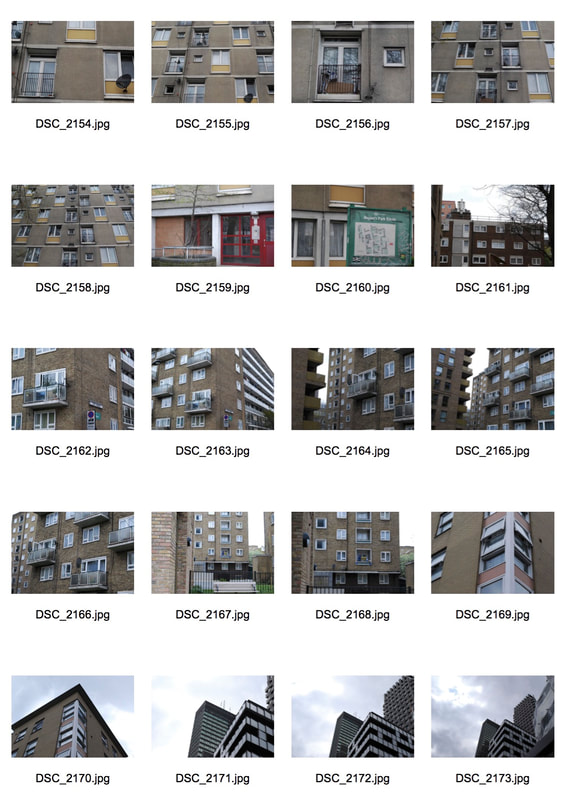
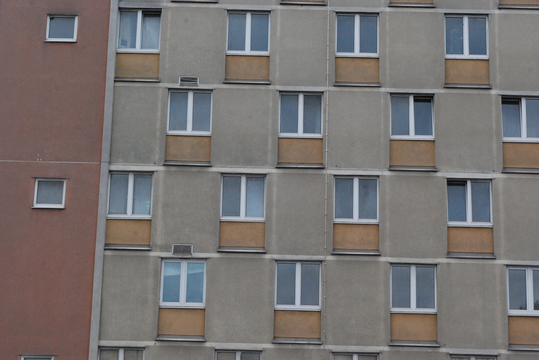
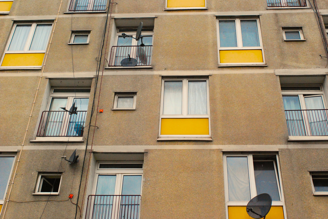
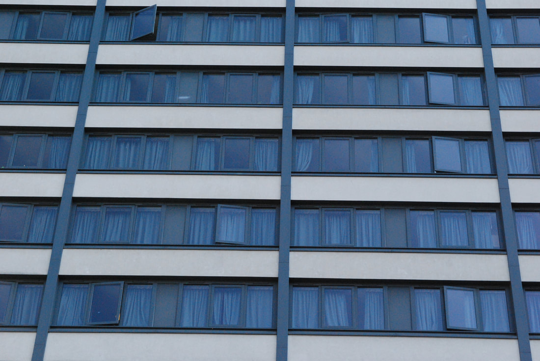
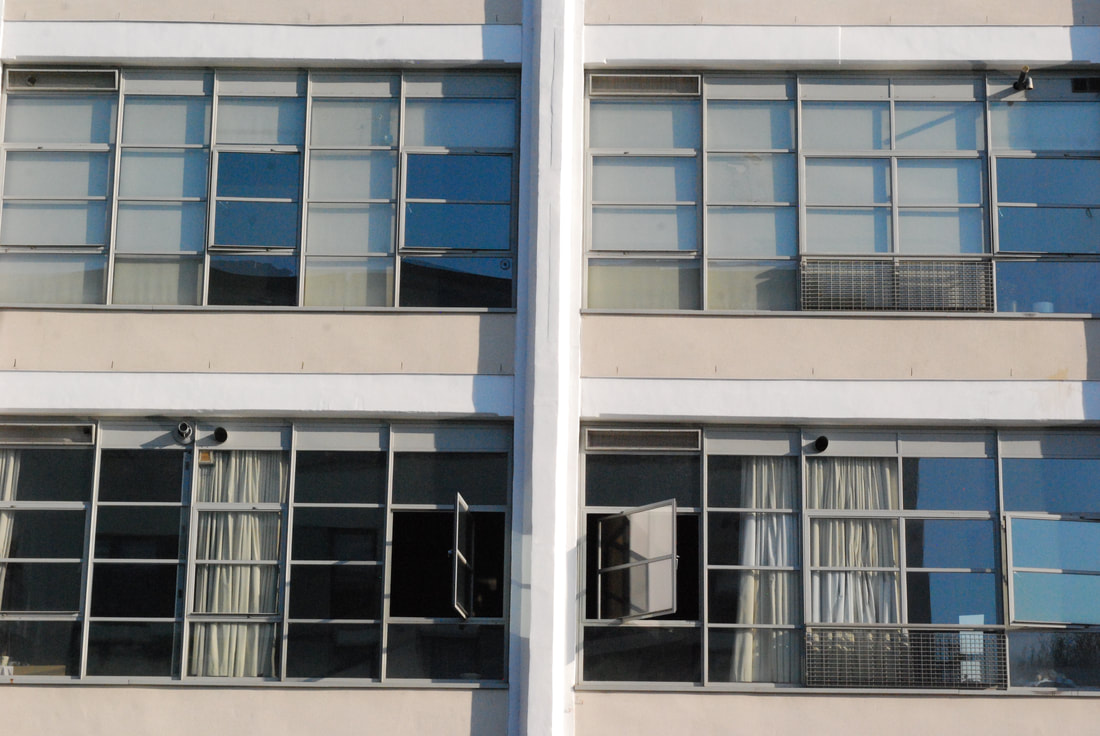
The second group of areas I chose to visit were Camden, Mornington Crescent and Oxford Street. Camden is notorious for diversity, similarly to Notting hill, and thus I started my walk in Camden. The population of Camden recorded in 2017 was 253,361 and this is made up of a large proportion of students and young adults, with relatively few children and older people. Every part of Camden has areas of relative affluence alongside areas of relative poverty. The Indices of Deprivation 2015 ranks Camden among the 69 most deprived districts in England. The most deprived area in Camden (found in Gospel Oak ward) is among the 5% most deprived areas in England and Camden ranks 4th highest in London. The cost of housing in Camden is amongst the highest in the country however, similarly to Notting Hill, there are social houses with 23% of households rented from the council and 10% in other social rented. I used my camera for every photo taken but unfortunately, similar to the Notting Hill shoot, the sky was grey and cloudy. I frequently used the rule of thirds however, I also frequently used low angles which sometimes made the estate blocks seem threatening and overpowering. Additionally, similarly to Notting Hill, I tried to capture different variations of housing in the same shot. For example, one image I took shows a row of privately own houses and an estate block towering in the background. After photographing Camden I walked to Oxford Street but passing Mornington Crescent which has a lot of social housing such as the Ampthill housing estate. The estate is identified by the distinctive colour coded tower blocks of red yellow and blue. Most of the housing blocks in Mornington Crescent had the same washed out colours, satellites and windows on the exterior and I used the rule of thirds to fill the whole frame of the block's exterior to emphasise this repeated pattern amongst social housing from the same era. I want to further develop the rule of thirds images I took of the estates where the whole frame is filled.
|
|
|
|
|
|
|
Selects:
|
|
|
|
|
|
|
|
|
Artist inspiration- Simon Kennedy
|
|
|
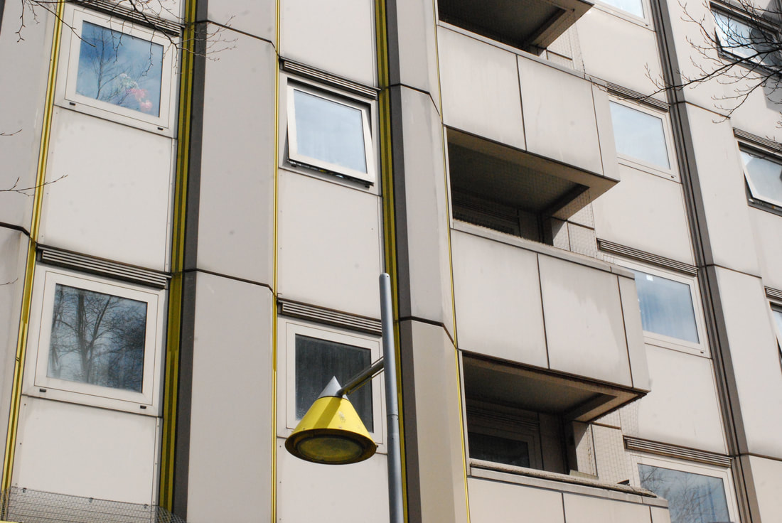
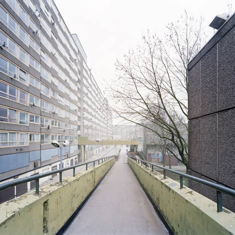
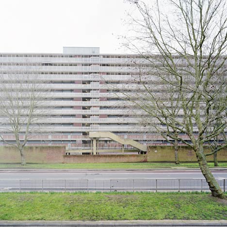
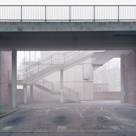
Simon Kennedy photographed a deserted south London housing estate awaiting demolition. The estate is called 'The Heygate Estate' and was completed in 1974. The estate now stands empty and awaiting demolition. Kennedy’s photographs emphasise the consequences of the painfully protracted if not perpetual contemporary ‘regeneration’ process which has left homes and shops conspicuously vacant for years on end. Kennedy's images all have a high exposure which emphasise the desolate, emptiness of the estate. Additionally, Kennedy's gaze is focused on the formal qualities of the estate’s exteriors and public spaces, selecting architectural moments, abstracting views and elevations, this reflects the emptiness of the estate and disassociates these buildings from their contentious histories, and any sense of domestic life. I really liked Kennedy's use of close up and far away angles and this is a technique I deployed throughout my shoot. I also really admire Kennedy's polemical message deployed through his photographs of the Heygate Estate which prompt us to contemplate not the failure of modernism, but the failure of the failure of modernism, and the possibilities for reclaiming a mode of utopian urban thinking.
Artist and Me
Kennedy's image uses a high exposure to reflect the theme of emptiness in his estate series. He also uses the rule of thirds to fill the frame. Kennedy manages to make the building seem so neglected through a high exposure and this also emphasises the failure of modernism which the series suggests.
|
My image also uses the rule of thirds to fill the frame. Additionally, I used the rule of thirds to reflect the repeated pattern of the same exterior design of the estates I captured, reinforcing the idea that these are functional, government buildings that serve a very specific purpose and their design is meant to reflect this.
I really like how Kennedy used a high exposure to reflect the failure of modernism but because the estate I captured was full of people I did the reverse and increased the saturation on Photoshop and thus the yellows on the windows and beige on the walls seem more enhanced and brighter.
|
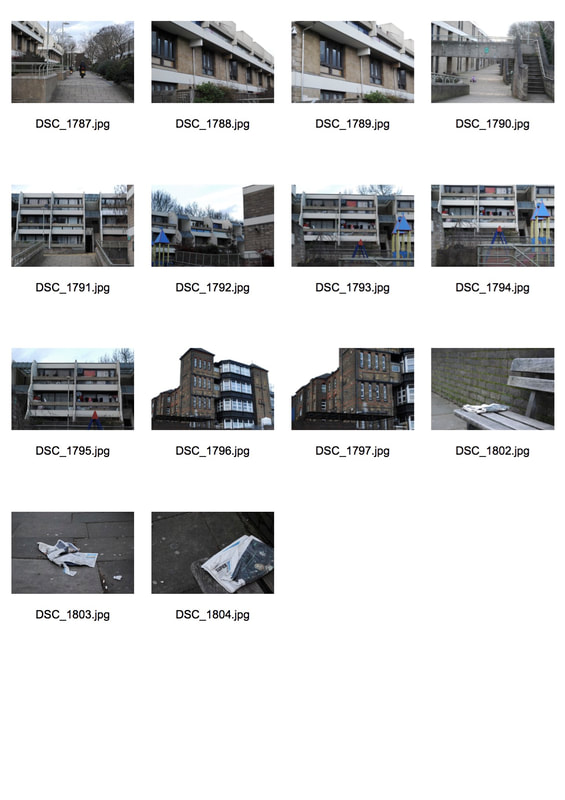
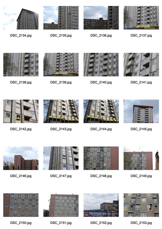
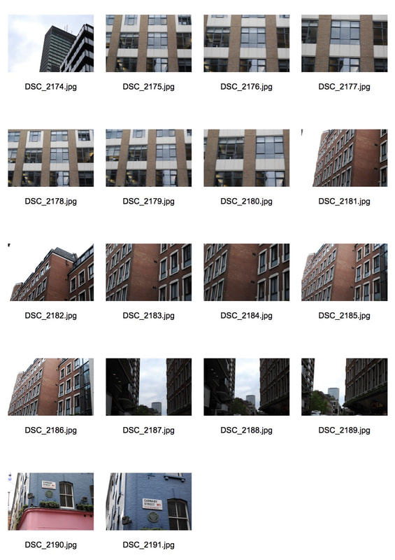
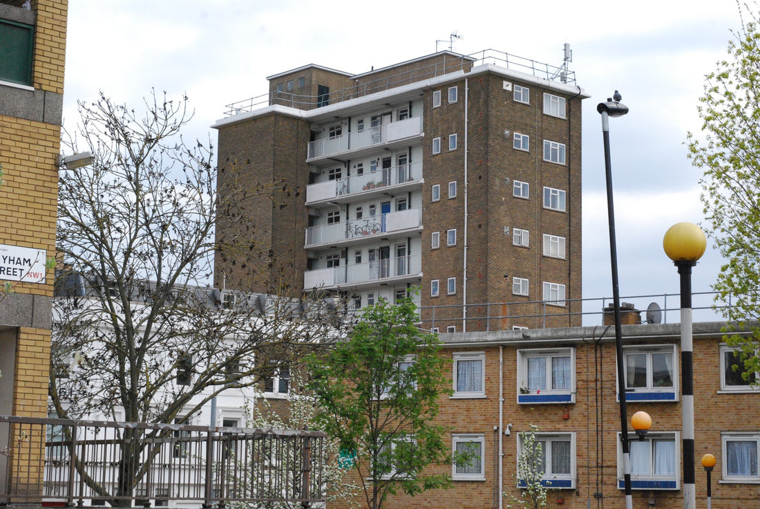
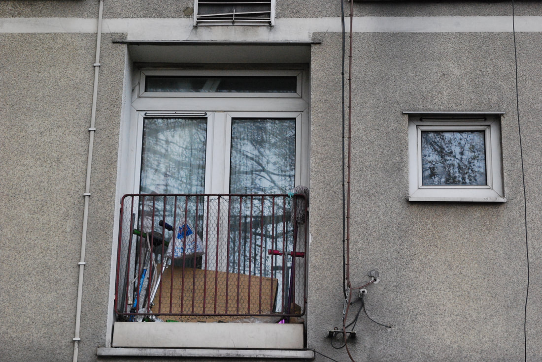
Belsize Park, Angel, Highbury & Islington:
The last group of areas I visited were Belsize Park, Angel and Highbury and Islington. Each area has predominately rich areas but Angel and Highbury and Islington also have predominately poor areas. I walked to Belsize Park, got the tube to Angel and then walked to Highbury and Islington. Luckily, the sky was clear all day and thus made my photos bright and the buildings more striking. Additionally, during golden hour, as the sun began to go down, the lighting was perfect as I photographed a block in Highbury and Islington. The images of this estate block have an orange and golden tone and the building stands out against the dark outline of the tree and blue sky. The colours also give the aesthetic of shooting on a film camera. To develop my strands I am going to experiment with monoprinting and look at artists such as; Alexey Bogolepov.
|
|
|
|
|
|
|
Selects:
|
|
|
|
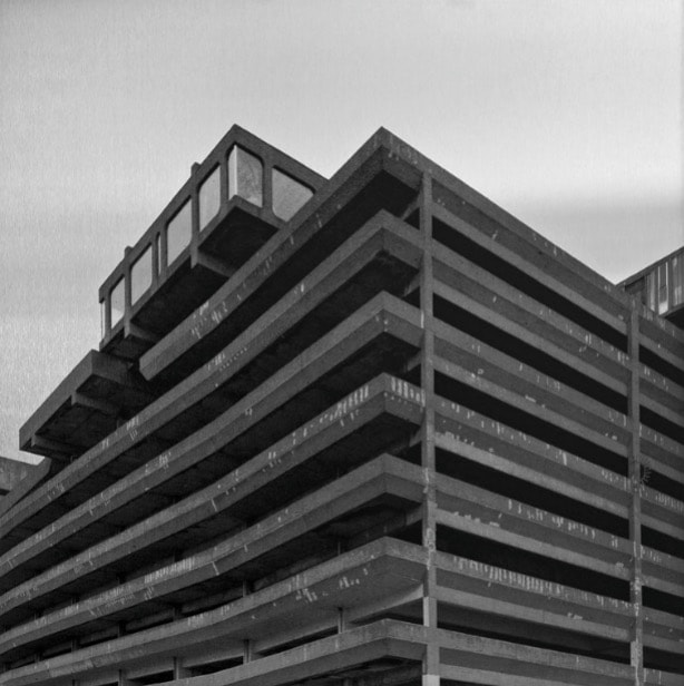
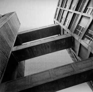
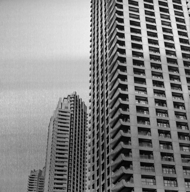
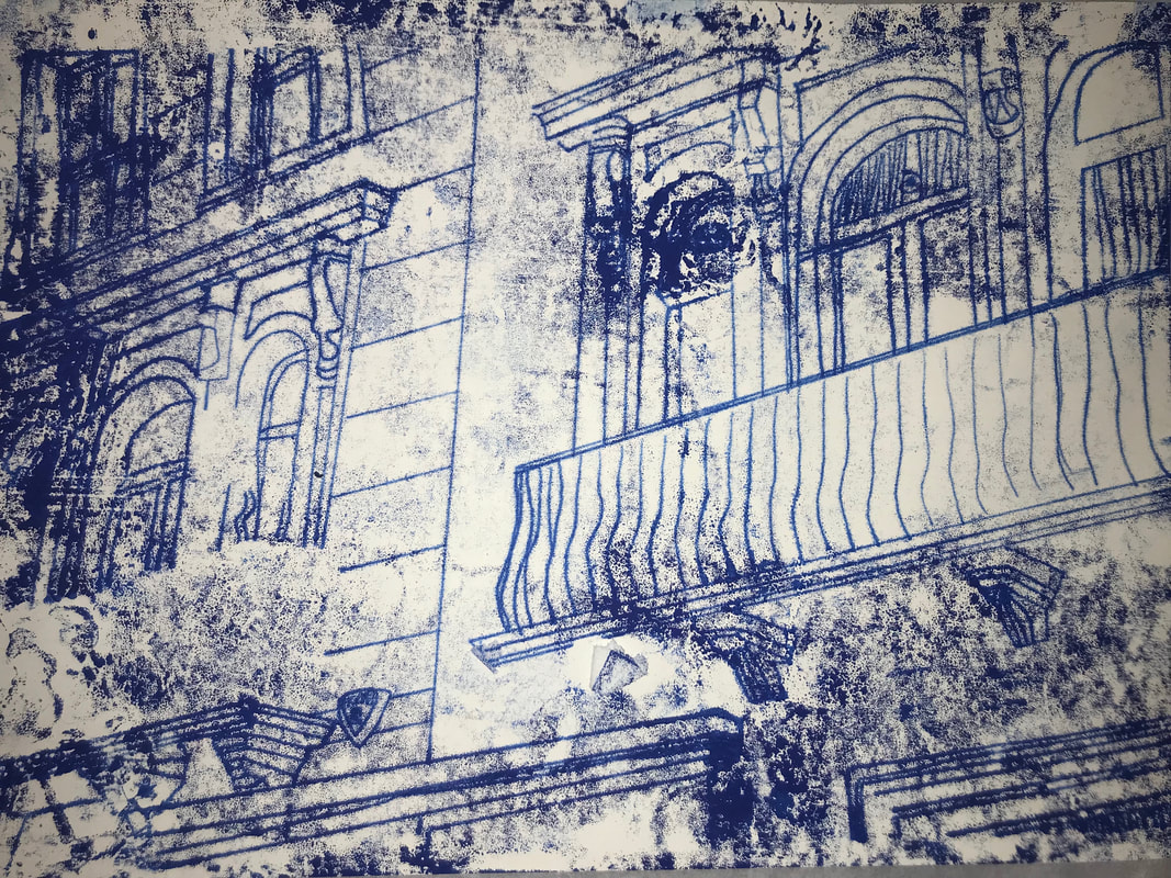
Artist Inspiration- Simon Phipps:
|
|
|
Simon Phipps' approach and execution to brutalist photography is something very unique. This is because rather than presenting his images as photographic prints, Phipps has produced them as monochrome images printed directly onto an aluminium substrate. Phipps said his intention with the series was to, "document and present post 1945 modernist British architecture that (loosely) fits into the idea of the social contract, that the state would provide housing and municipal buildings for the people." I really admire Phipps' images as they represents so much then just concrete buildings. They are about politics, culture and the social environment of their time. Additionally, the images have an aesthetic of shooting on film camera which I felt my images also had through the softness of the colours as the sun set on some of the buildings.
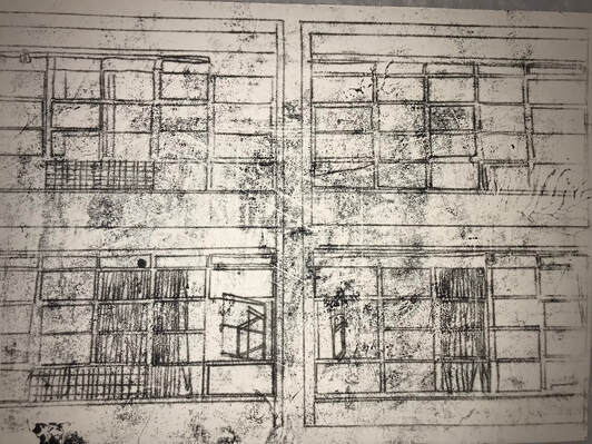
Mono-printing:
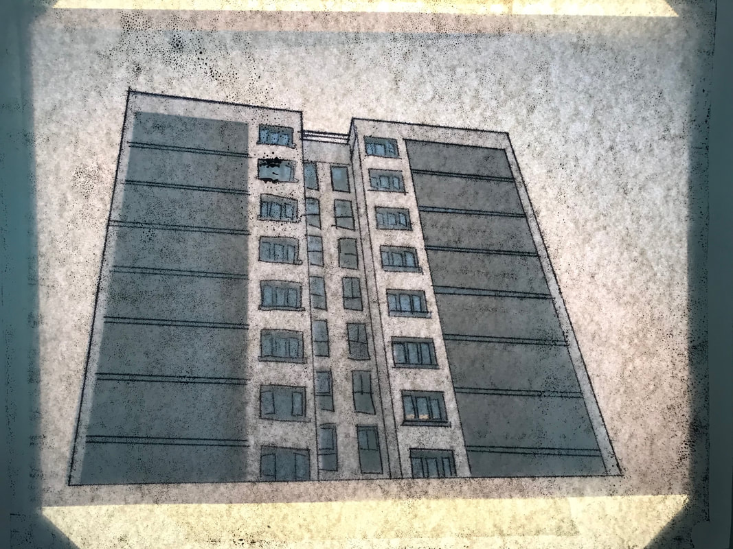
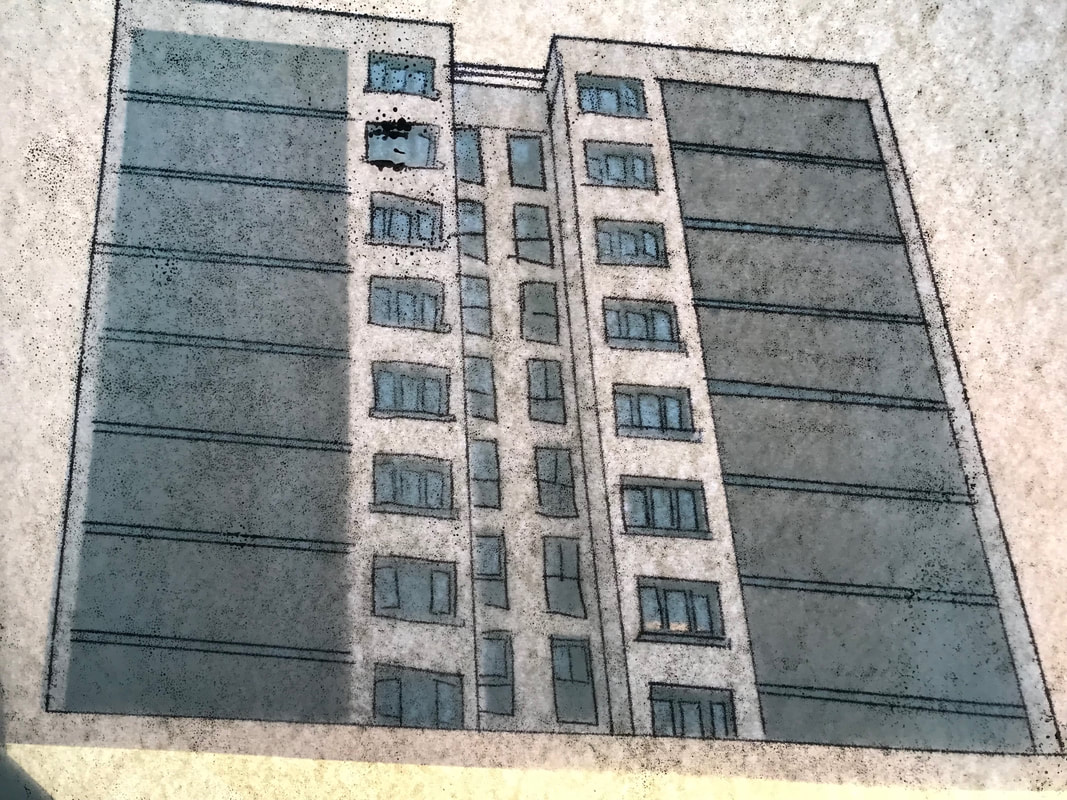
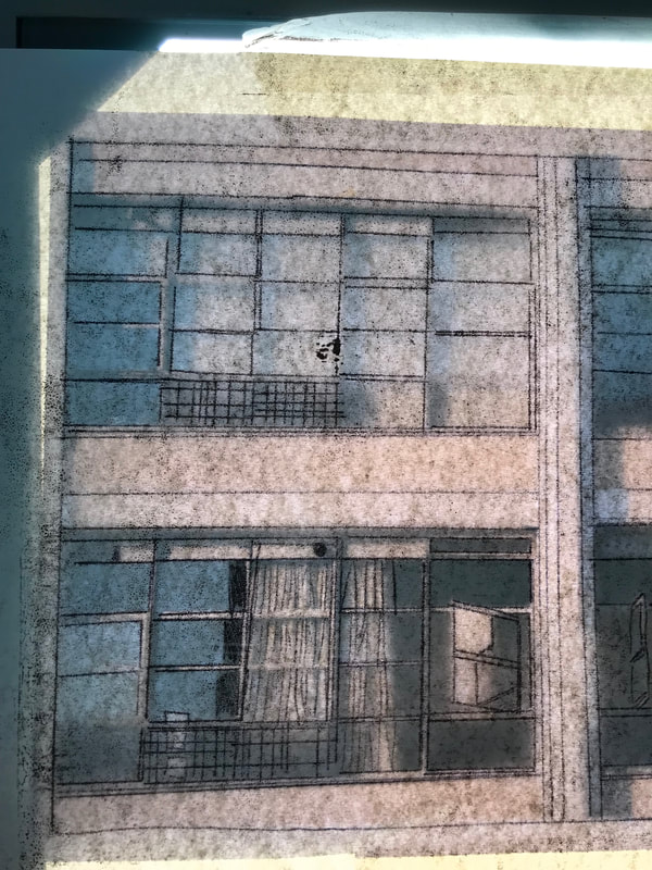
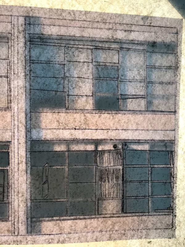
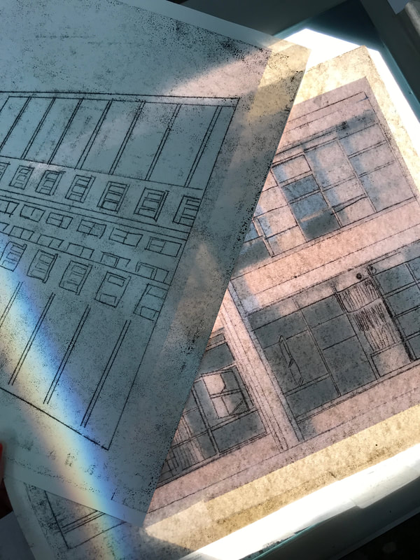
For my final piece, I want to create a typology for both my digital photos reflecting the variation and similarity within London housing and of images I mono-print. To practice I used two of my images from Highbury and Islington and started experimenting with mono-printing. I want to mono-print both close ups and far away shots of buildings as I like the mixture of angles I used whilst out taking photos. My lines will be more straight as I was just starting to experiment and I want to also experiment with colour. This is because the images bellow still have the original photo stuck behind and thus the colours are shining through, I really like this effect as it looks like there is faint blue coming thorough the windows I have mono-printed. Furthermore, I want to stat experimenting with overlapping the images, possibly using acetates. The images bellow were taken on top of the projector with my iPhone. I really like the colours that placing images onto the projector creates such as in the final image as a faint rainbow can be seen.
|
|
|
|
|
|
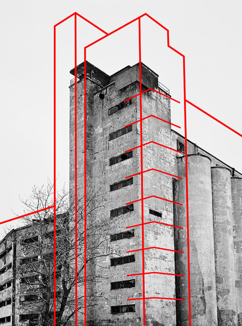
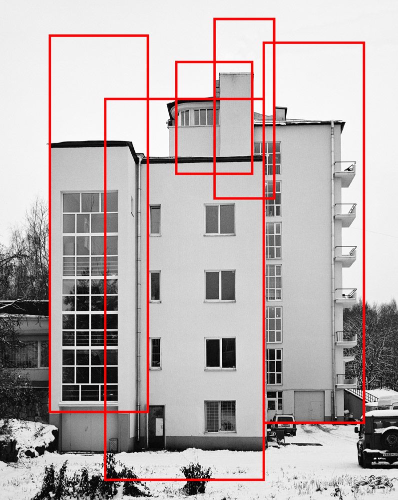
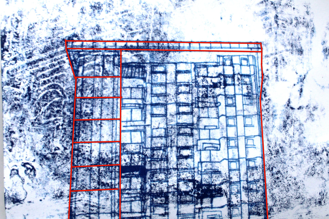
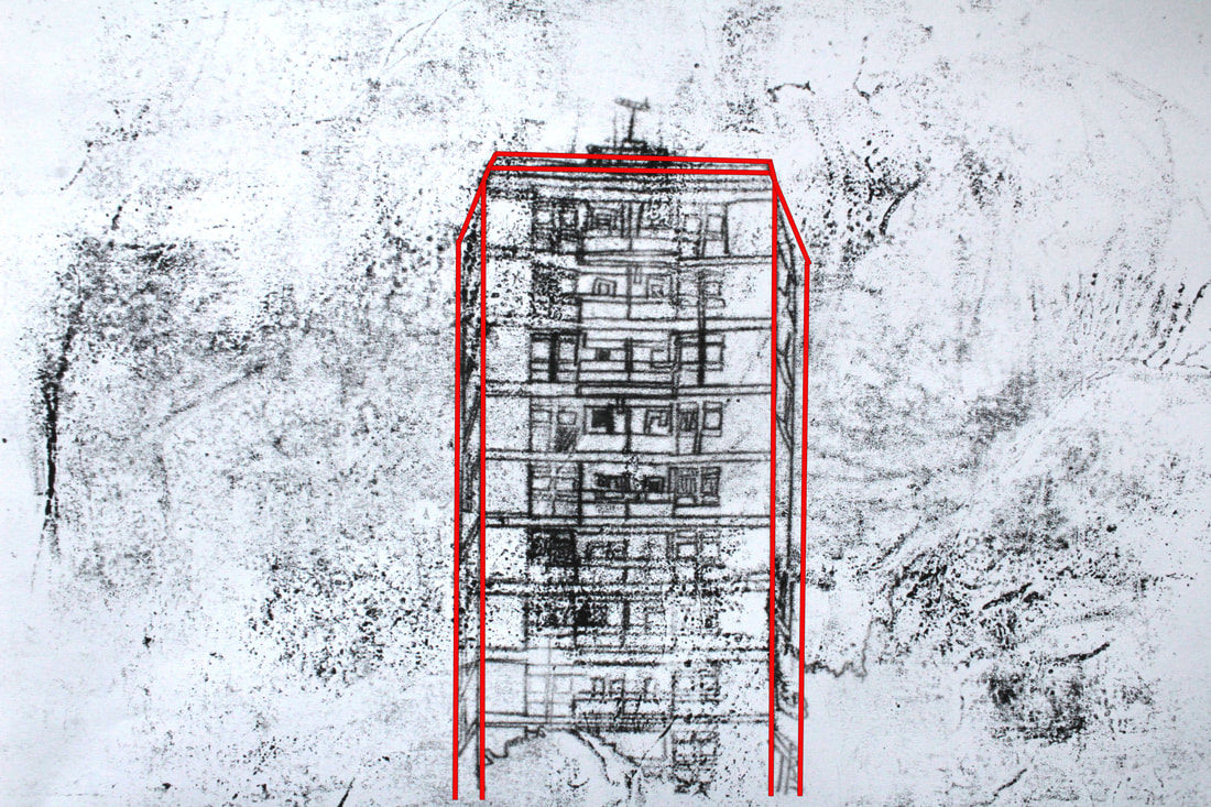
Artist Inspiration- Alexey Bogolepov:
|
|
|
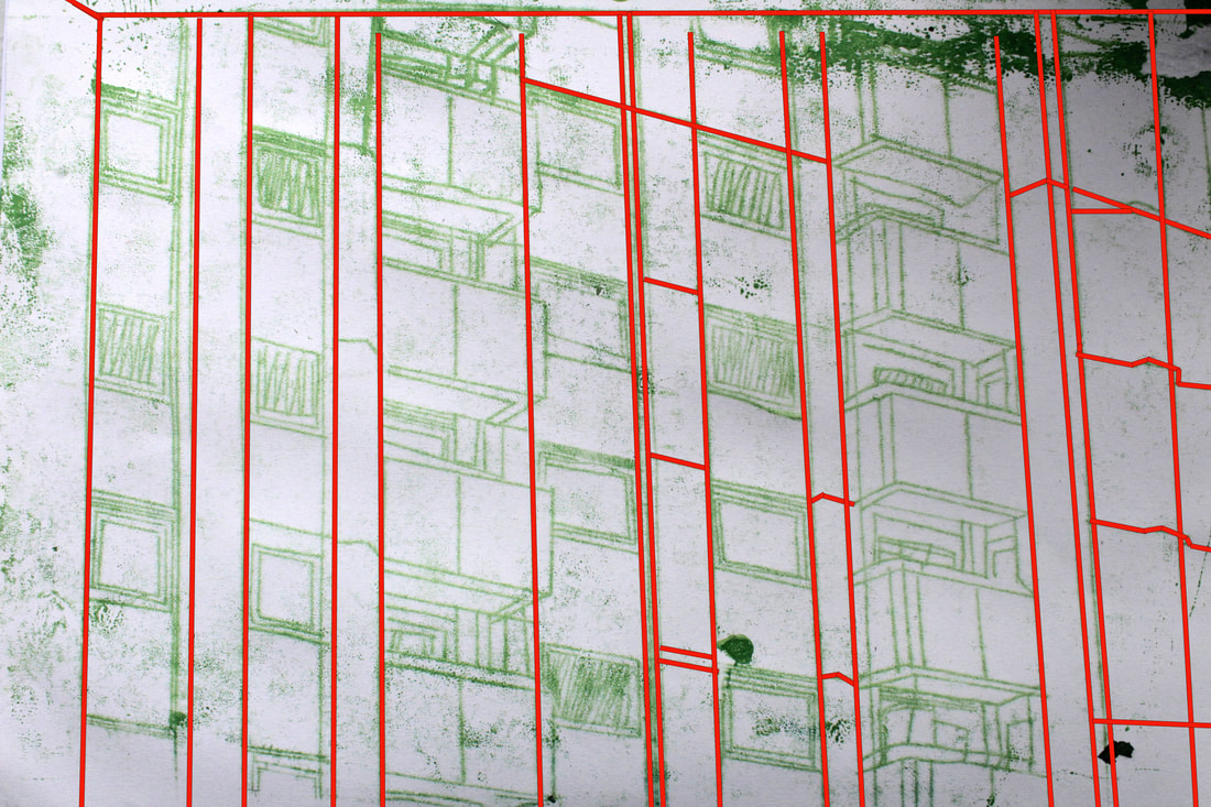
Alexey Bogolepov is a 29 year-old Russian photographer currently based in Saint Petersburg. Alexey created a series called BLOC where he photographed a series of austere buildings constructed in Saint Petersburg during the Soviet era, in a clinical, detached manner reminiscent of the seminal work of Bernd and Hilla Becher. Alexey then digitally placed red lines reflecting the outline of the building. The weight of the lines varies between each photo. Alexey done this because if the building consists of fine details, this would not have suited a thick outline. To develop my mono-printing I want to try Bogoelpov's red line editing but with using my mono-printed images instead of digital images. I will then on Photoshop place red lines over my mono-printed images using the tools 'fill' and 'stroke'.
Final Piece Build UP:
|
|
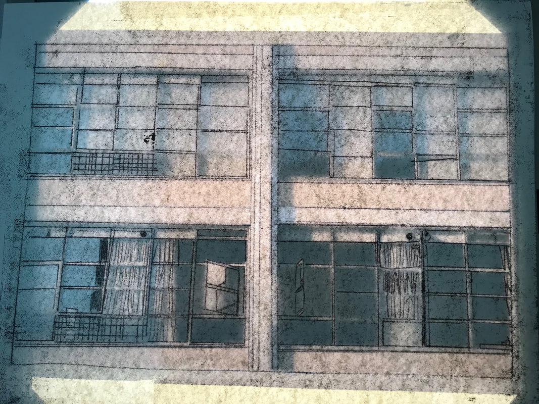
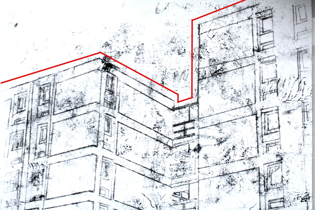
These are two of my mono-printed images that I chose not to edit on Photoshop and display as my final pieces, but I still really like the detail within the images. Unfortunately, I pressed down on the ink to much and therefore the images have quite a few marks on them, but the details such as window frames or the alarm on the exterior of the second building came out really successfully. Creating images which seem a bit chaotic but still focus on details of the building. I found blue was the most successful colour as it both brightened up the image but also the lines seemed to come out more bold and fixed whereas, with the black the lines came out more faded.
Final Pieces:
|
|
|
|
|
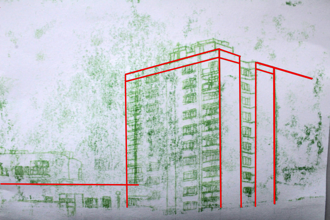
|
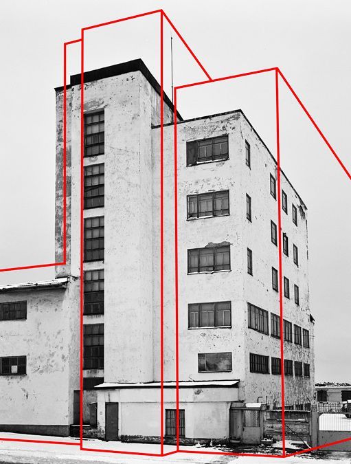
I edited six of my ten mono-printed images which I created in the first day of our exam. I picked the six which I felt would look the most effective with Bogolepov's red lines. I first stared drawing on the red lines but quickly realised this was not effective and each line would have been a different size. I then opted to use the grid on Photoshop to measure up exactly where I would place each line- not only did this make the process more efficient but it ensured each line would be the same size. I then used the tools 'fill' and stroke' to create the red lines. My favourite images are the simpler ones such as; the first on the left and last image on the right. This is because I feel like the less red lines there were on the buildings, the bolder the overall image looked. I preferred just one or two lines instead of having to cover every corner of the building. My images differ from Bogolepov as he chooses to place the red lines as if they are overlapping the original image whereas, I wanted to simply trace the original lines of the structure.
